The Art of composite images, including many examples of their own images.
Thoughts on inspiration and ideas for composite imagery.
A hands-on demonstration of photography with model Loren, including some discussion of lighting, posing, props etc.
A discussion of DIY / low-cost and improvised props and equipment (stay tuned … I’ll make a page with some low-cost suggestions shortly)
A live-demonstration of post processing including consideration of lighting and shadows, selection (especially the “Black on Black” approach), blending, colour matching, adding mist, and adding texture overlays.
Links to many resources detailing these topics is at the end of this post.
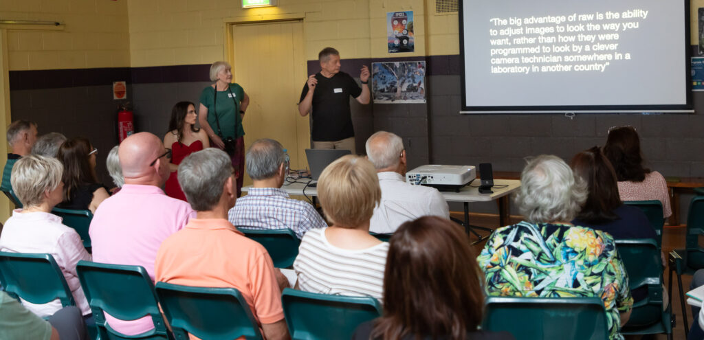
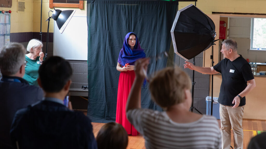
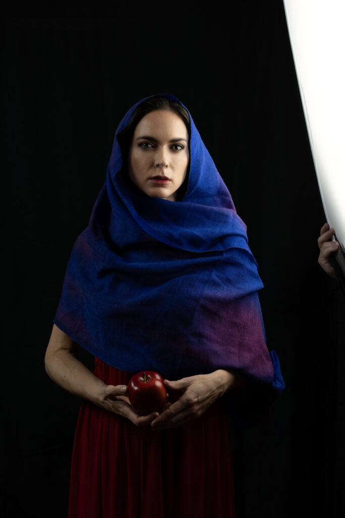
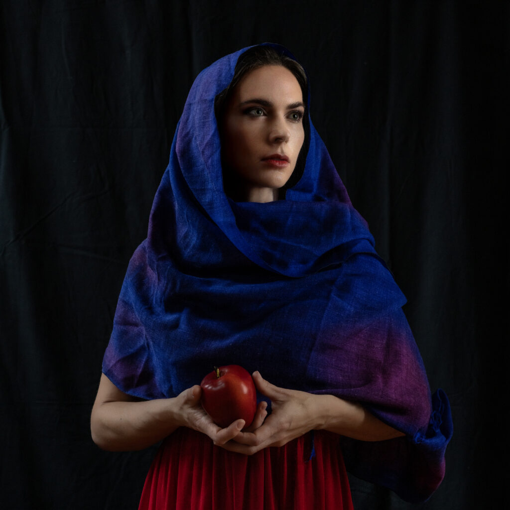
Transfixed audience as Rob presents; Sharon and Loren to his left. Image: G Shaw.The “studio” setup. Note use of 2 soft-boxed light units (continuous lights were used during the demo for clarity). Rob demonstrated use of additional diffusers to get a softer light. The backdrop was a bit of black cloth (this cloth was fairly thin, so a second drape was added behind to increase the blackness) clamped to a horizontal tube supported by light-stands. Loren (model) has an op-shop long red gown with a blue cloth arranged as a shawl/hood. Rob and Sharon got her to hold an apple as a way of giving her hands something to do. It works well (see worked images below)
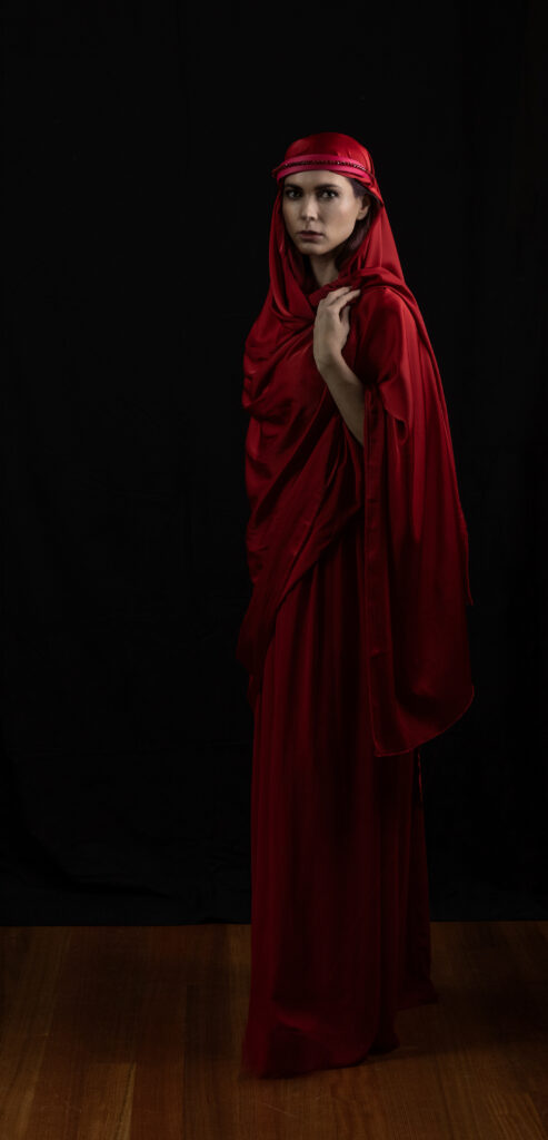
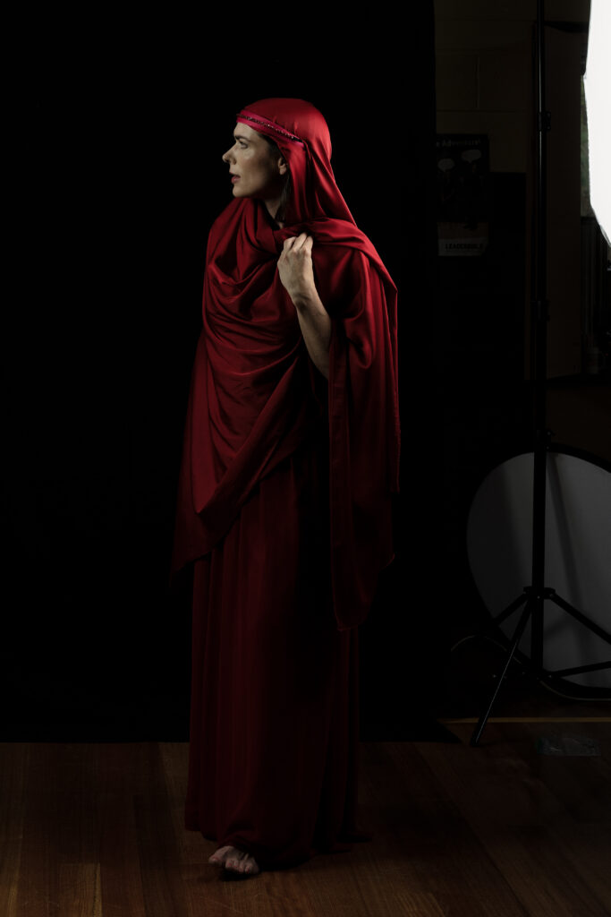
A Selection of Sharon’s Images of Loren from the workshop
Some worked images from the workshop
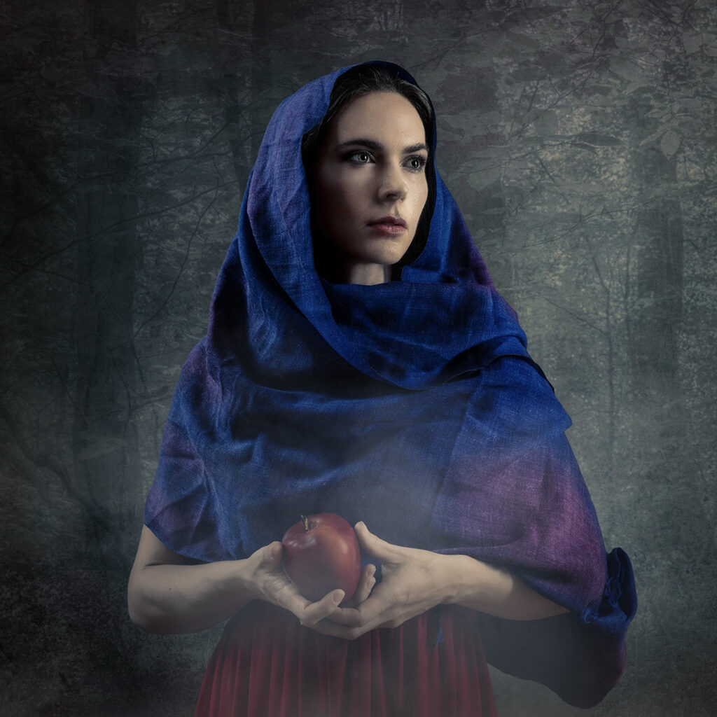
Here are a couple of images that Sharon Prenton Jones worked up, using the portraits of Loren, that she took during the workshop. The second image, given the title “Aurora” earned Sharon (well deservedly) a PSA Gold award in the 8th International Salon Unlimited Photo 2024 (Sharon also got two other gold awards, a merit, and 12 other acceptances in this Salon!)
Loren in woods. Image and compositing: Sharon Prenton JonesLoren portrait. Image and compositing: Sharon Prenton Jones
Our heartfelt thanks to Sharon and Rob for an illuminating session and to Loren for her modelling skills.
More Resources
More resources from this workshop will be linked below as I get round to them:
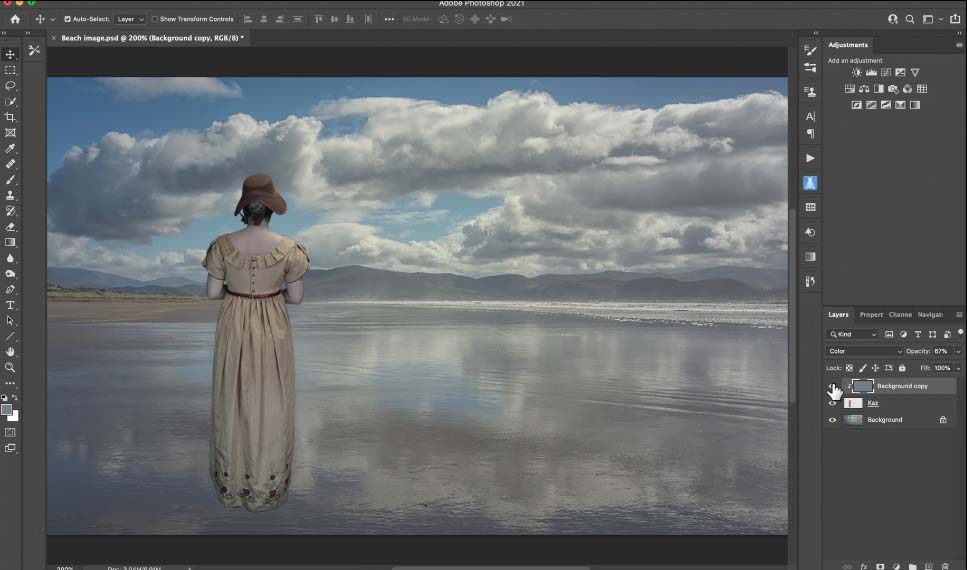
Often, when you are compositing images the colours of the two (or more) source images may not match. Perhaps you have a model taken under studio lights that you want to layer onto a background with a different colour balance. There are several ways to achieve a better colour matching. Here is one, presented to WCC by Sharon Prenton Jones (https://www.prentonjonesphotography.co.uk/) who kindly sent us a movie explaining her technique.
Mist can enhance some images, and adding a misty effect in Photoshop is not difficult. Here is one approach, based on the method demonstrated by Sharon Prenton Jones at a WCC workshop, Jan 2024. In this work through I am using Photoshop, but the same principles apply with most similar alternatives that provide for layered images.
Note that there are many alternative approaches, such as using a custom brush to apply a mist effect.
An example – a base layer
Let’s do this with an example. This is a quick edit, not meant to be perfect, but to show the process. I leave it to the reader to perfect the process on their own images.
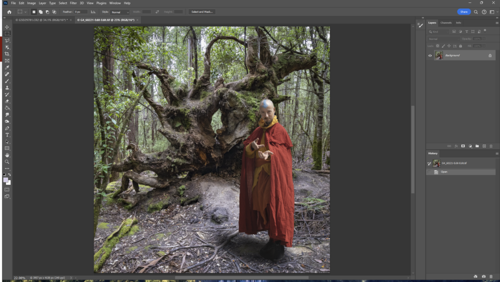
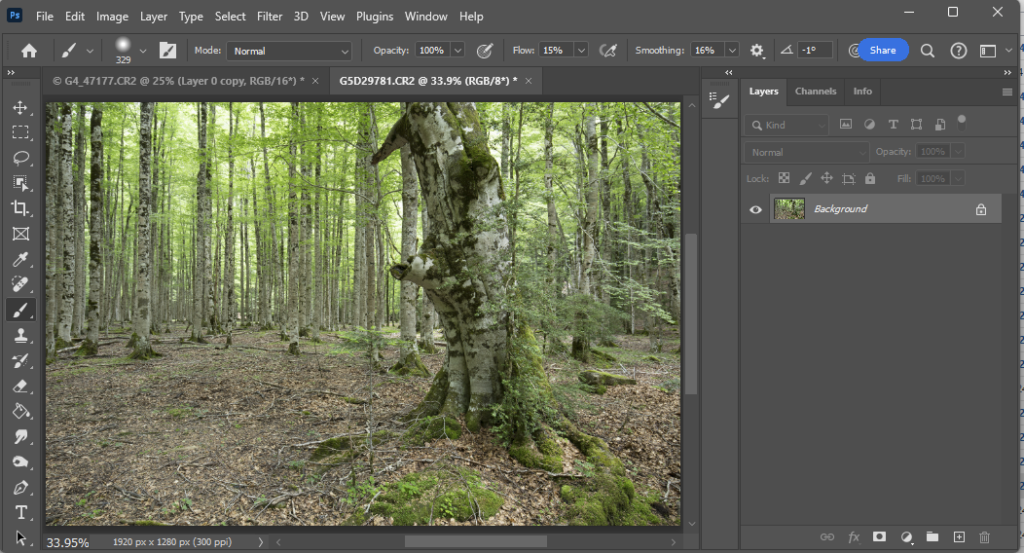
Here is a starting image (here I have composited the wizard onto the forest and added a shadow to “ground” the person:
Add a cloud layer
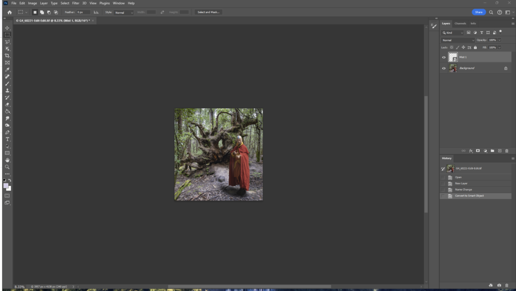
First, add a new layer (Shift-Ctrl-N). Change the name to “Mist 1”, so you don’t lose track of what your layers represent. Maybe reduce the zoom a couple of steps (Ctrl-minus) in preparation for the next step.
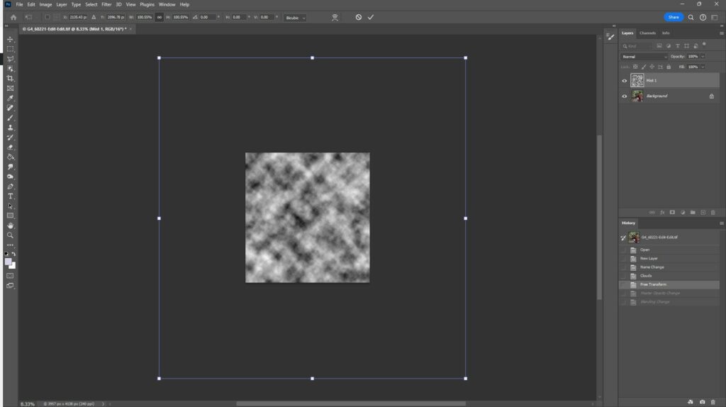
Now add a “cloud” pattern. In Photoshop you can use menu: Filter>Render>Clouds. This will add a speckled black and white pattern over your background layer. Alternatively, use your own starting pattern (see below).
Transform and adjust the starting cloud pattern to suit your base image
Use Transform (Ctrl-T) and drag the corners out to spread out the pattern (this affects how granular your mist effect looks).
Press Enter to complete the transform. Set the layer opacity to a lower number – I have set to 45% here as a starting point, and set the blend mode to screen
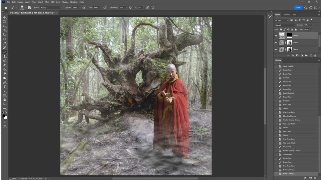
Refine your mist effect with additional layers and masking
Now we are getting the start of a mist effect, but we need to refine it. The further away things are, the thicker the mist effect, and probably there is more mist lower down than higher up. This is easy to achieve using layer masks (and perhaps more mist layers to be added). So, add a layer mask and paint with black (use a soft brush with low flow) on the mask to reduce or remove some of the mist – for example paint over the wizard; a little less on the tree root … closer things like these and the foreground ground will need less mist to be convincing. Perhaps add a second mist layer to add an extra depth… Maybe add another layer masked at the top to add a bit of low mist over the ground … Tweak the opacity of the layers… have a play. Try with different starting patterns. I don’t think Photoshop’s render>clouds ideally mimics real mist (see below for an alternative approach), but if you do use it, try stretching the pattern laterally using Transform; maybe try a linear blur or other distortions; using multiple layers to build up the mist effect better reflects reality – but use masking to restrict some layers to the far background whilst others will reflect closer mist with appropriate masking; alter the granularity/texture of the further mist layers – further away should have smaller texture than close up; tweak the opacity of the layers to get the effect you want. The example below is far from perfect, as it was made as a quick example to demonstrate the technique.
Here is a before/after of the image – slide the middle bar left and right to change what you see.
Study mist so you can accurately mimic it
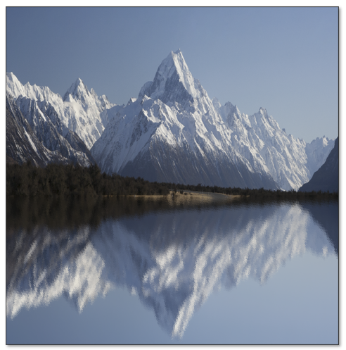
Spend some time in misty places to observe how mist looks as it wraps round objects and recedes into the distance. There are different sorts of mist: think of the thin, ground hugging mist layer over a sports ground on a crisp morning; or the dense, featureless mist as a cloud envelops you on a mountain peak; or thin tendrils of mist weaving through a forest on a crisp winter morning. Some mists hug the ground; other times the mist will envelop the tree tops but leave the ground clear; and sometimes the mist is everywhere. What sort of mist do you want to generate? I have put some (not exhaustive) examples below.
Experiment with alternative cloud images
Experiment with different starting points. Above I have suggested using Photoshop’s Filter>Render>clouds. Try tweaking this by stretching the pattern horizontally, distorting the pattern using warp, liquefy etc to get a different texture (probably more like real mist).
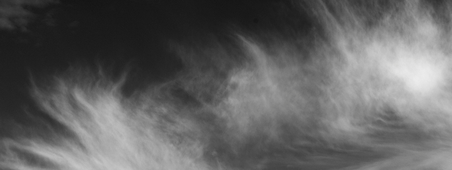
Maybe take a picture of wispy cirrus clouds (convert to B&W and adjust the conversion so that the blue sky becomes black with grey-white clouds – the black background will disappear when the layer is later set to blend-mode screen leaving you with just the grey to white cloud pattern forming the misty overlay). Here is an example – I edited a cloud picture, convert to B&W with blue luminance dropped, then used curves to push the open sky to black and the clouds shades of grey up to white.
Some clouds, adjusted to black and white to form a basis for fake mist layers.The starting image of a forest
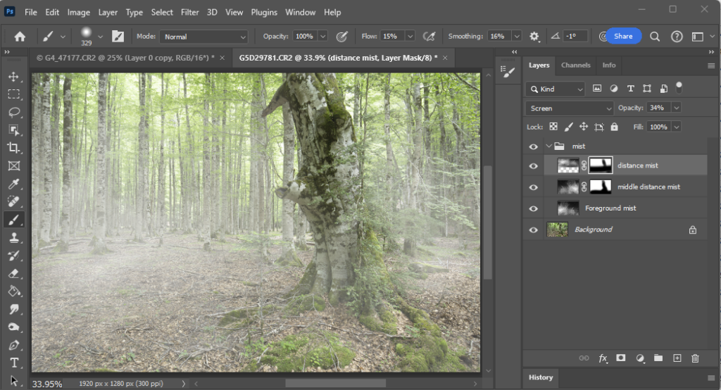
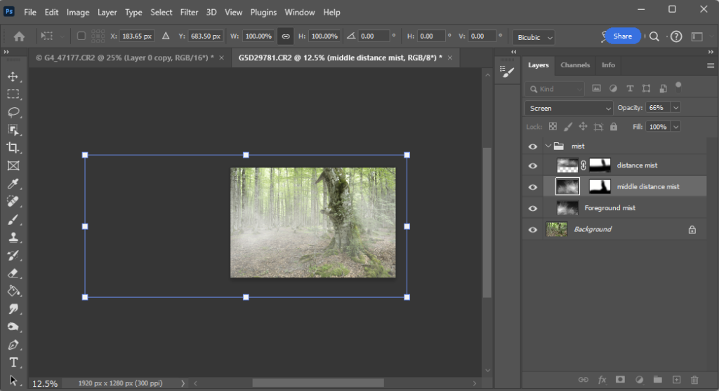
Then I added this over my forest image as 3 layers (Blend mode Screen; and I started with opacity 30% in this example; adjust to suit your needs depending on the particular images you use) for foreground, middle and distance, each at a different scale, (transform and drag corners for size, flip horizontally for one or more, move around to put the cloud overlay at suitable places so the 3 layers are all different in size and position). I masked the layers. Distance got the foreground ground and closer tree removed; middle got the tree and a little of the nearest ground masked; foreground mist has no mask. To be tidy I grouped the 3 mist layers into a group, and all the layers were given appropriate names so if I come back another time and want to play with the layers, I will know what all the layers represent. Save as a layered TIFF or PSD file, so you preserve all the layers for future edits.
The forest with “mist” layers added. Note the masking. Final layer opacity was34%, 66% and 64% for the distant, middle and foreground mist layers respectively.
If you want to tweak the appearance, there are a few options. Adjust the opacity to increase the density of the mist (you can have different opacity for each layer if that suits your needs); click the chain symbol between the layer image and layer mask to decouple the mask from the image. Now you can use Transform (Ctrl-T) to move/resize/distort the mist image layer without altering the layer masking. See how the mist appearance changes as you move or alter the mist image.
Using Transform allows you to drag the mist around, stretch it, shrink or enlarge it, warp it… play with scale and shape and position until you have something that suits the background image you are “mistifying”.
If you add another image (maybe a knight in shining armor in the middle distance would fit this background image) you will need to put that layer behind the foreground mist layer and in front of the background mist layer; or you could put it behind all the mist layers and adjust the masks (more work that way) … anyway, I am sure you can work it all out.
Mist takes many forms
And remember that mists are not all the same. Here are some examples:
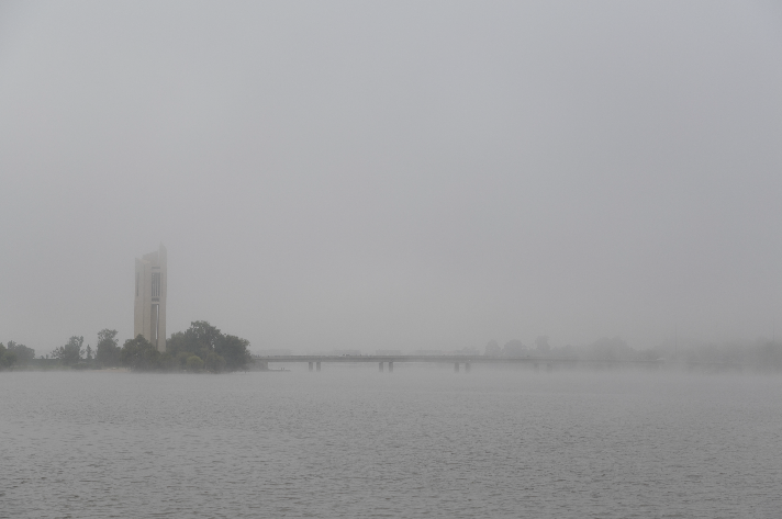
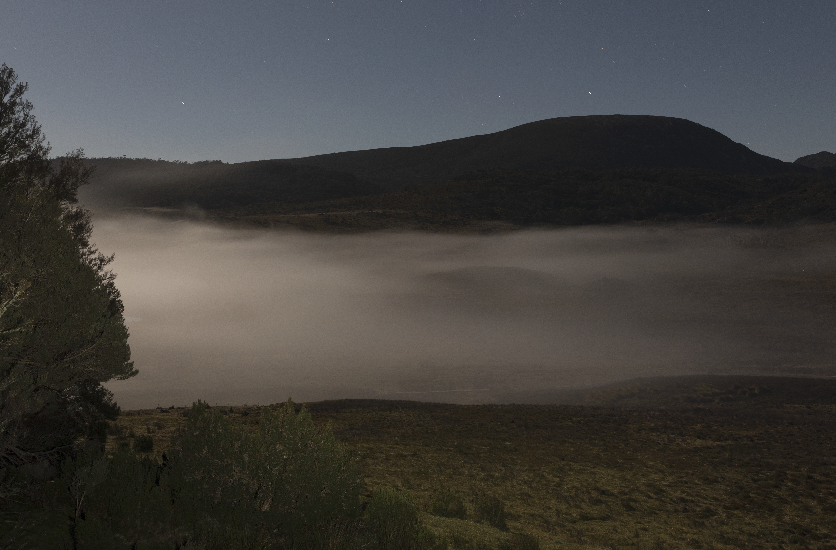
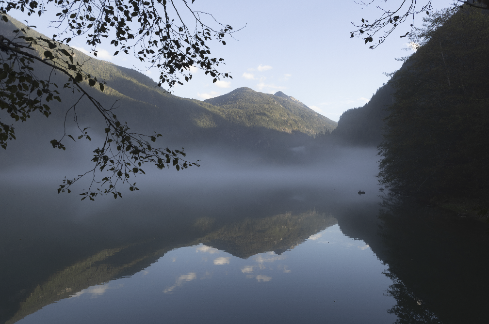
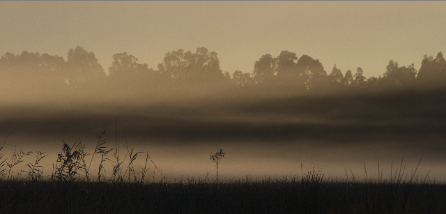
Here the mist is is thicker a few metres above the water, and is fairly uniform.In this moonlit shot the wisps of mist fill the valleyHere the mist forms a discrete band flowing down the valley over the water. Where I am standing there is no mist at all.Barmah forest, shot into the sun around daybreak. The mist has a distinctive structure with multiple layers.
Following the 2023 AGM, WCC had a fascinating Workshop on LIFE Magazine photographers with Alwyn Hanson.
“LIFE Magazine is the treasured photographic magazine that chronicled the 20th Century. It now lives on at LIFE.com, the largest, most amazing collection of professional photography on the internet. Users can browse, search and view photos of today’s people and events. They have free access to share, print and post images for personal use.” Google books.
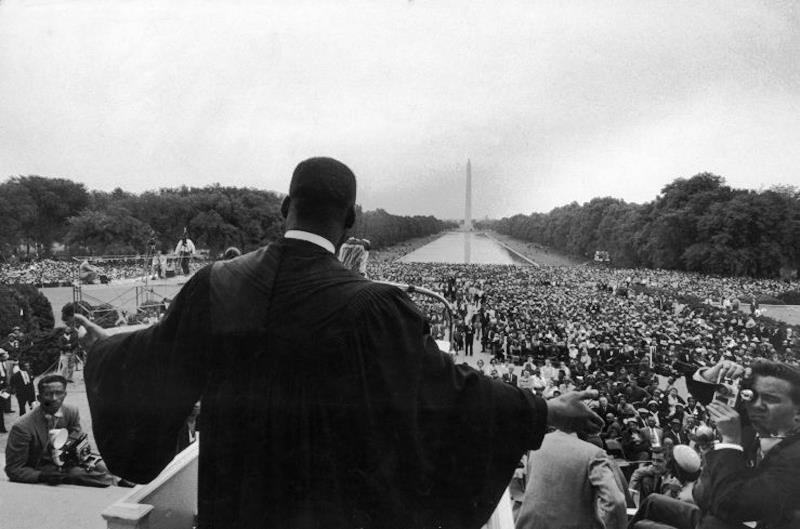
Martin Luther King Jr. Originally snapped in 1957 at one of the early Civil Rights rallies in Washington D.C., the photo would go on to become one of the most famous of the Reverend and one of the most recognizable photos of the Civil Rights Movement itself. Despite being taken nearly nine years earlier, the photo was not published until a week after King was assassinated in 1968.
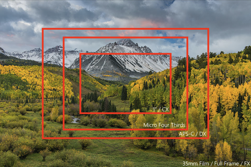
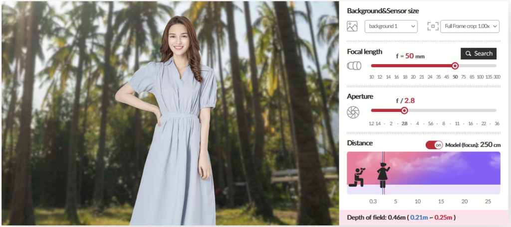
How do you take similar photos using two different cameras? For example consider an image I might take with my Canon R5 (full frame, 45 MPx) an image with a 50 mm lens. To get the same field of view on my Olympus OMD EM-5 mark ii (micro four thirds sensor with 16 MPx) I need to use a 25 mm lens. And even then the images are not equivalent because the R5 has 3 times as many pixels. And at a given aperture, depth of field is greater on the EM5 than the R5 (for example 25 mm f2.8 on the EM5 is roughly equivalent to 50 mm f5.6 on the R5). But wait, there is more … the two links below should give you a broader understanding of how sensor size, pixel density, focal length, aperture and ISO all interact.
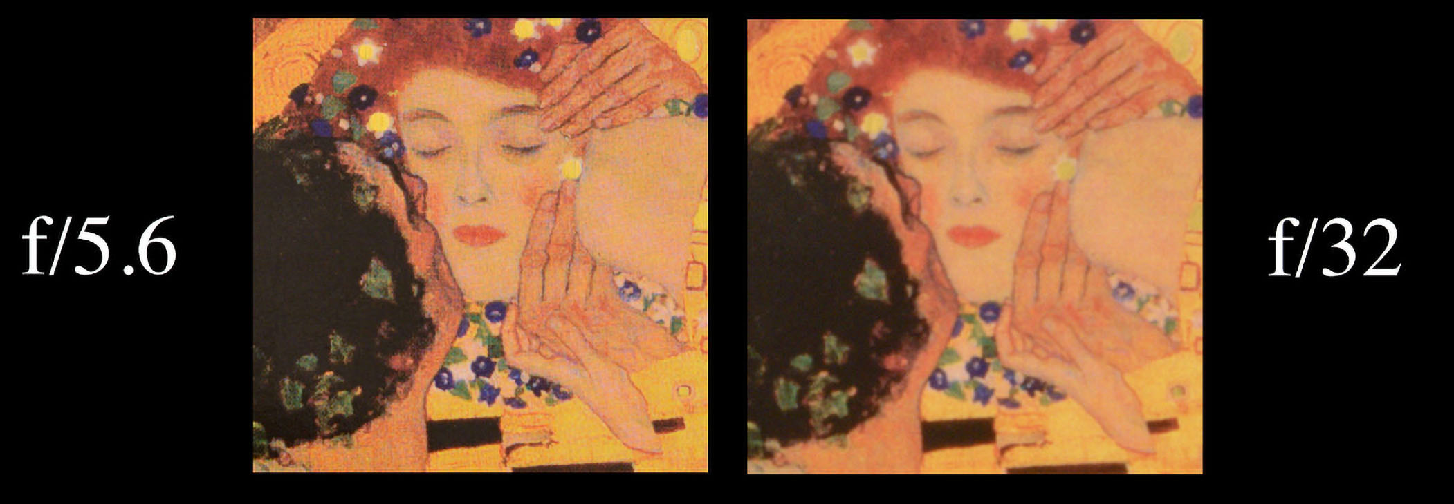
You have probably heard of lens diffraction and its effects of softening your images when the lens is set to a small aperture (large f-number). The image above illustrates diffraction effects (Click on the image to see an enlarged image in a new tab that more clearly demonstrates the diffraction effects. Modified from https://photographylife.com/wp-content/uploads/2016/04/The-Kiss-diffraction.jpg.)
Diffraction is present in all your photographs, and – if you aren’t careful – it can rob some sharpness from your favorite images. However, once you see its effects in practice, diffraction will become second nature.
If you want to find out more including:
the causes of this effect
how much it might affect your images depending on
sensor size
pixel density on the sensor
and the interaction of aperture on depth of field and diffraction (wide aperture –> focus softening vs small aperture –> greater depth of field, but diffraction softening)
Here is a useful resource to help you get your head around depth of field and how it changes depending on aperture, focal length, focal distance and sensor format. You can see the effect of changing any of these parameters on the field of view and the depth of field. You can explore this simulator at https://www.samyanglens.com/en/product/simulator/lens.php.
In case you haven’t come across Samyang before, they are a well established and well respected optics maker, and produce a wide range of photographic lenses in various camera mounts.
The homework exercise is to create a “surreal landscape”. I made some suggestions in the presentation but there are so many possibilities, so feel free to use whatever approaches you like.
Seek inspiration in fairy stories, on the web etc
Will your image have a narrative or recognisable memes
Browse your photo collection to find potential source images
Play with some of the techniques I mentioned (or any others you know or find out about)
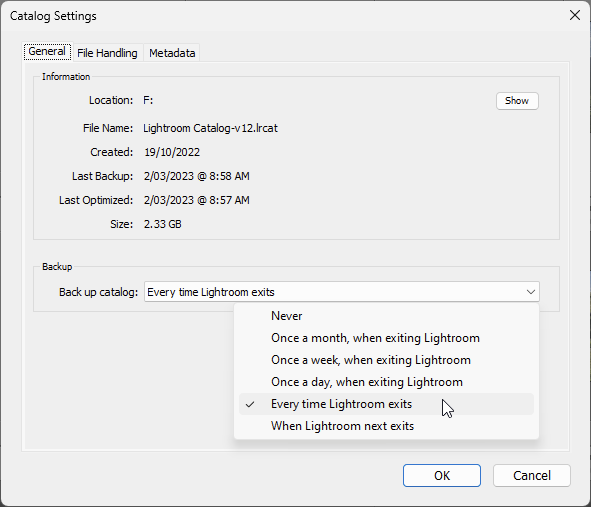
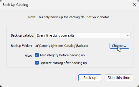
It has always struck me as dangerous that Lightroom Catalog Backups are stored in the same location that the active Catalog. If that drive fails (and they do so more often than one expects, see HERE) then you lose both your Catalog and your Catalog backups. I have finally found where you can tell Lightroom to put the backups somewhere else. The dialog is well hidden.
You can only get to the relevant menu when LR is about to start a backup, so… Start LR, and open the menu Edit>>Catalog Settings. This opens the dialog below and choose the Backup every time LR exits option. This will force LR to open the Backup dialog when you close LR.
So close LR. On the menu that appears, you can choose a folder in which to store your backup catalogs. My recommendation is to store the backups on a drive other than the one you use for your working catalog.
Click the Back Up button to make your first backup at the new location. Depending on the size of your catalog, this may take a while. You may not want this wait every time you exit LR, so next time you start LR, go back to the Edit>>Catalog settings menu and change the setting to, say once a week (or whatever suits you; or you can change this in the Backup Catalog dialog when it offers to make a backup).
Note that LR never deletes older backups, so from time to time it might be worth going in to the LR backup folder and erasing the oldest backups to save disk space. Keep the most recent two or three, just in case there is a glitch (unlikely, but always best to be safe). I also copy the most recent backup onto an external backup drive from time to time, to ensure that I have an additional backup of the catalog (without the catalog you lose all the edits you made, even if you have the original raw files still). And, of course, you should keep backup copies of all your image files too, preferably kept somewhere away from your main computer. If flood, fire or other disaster strikes, you don’t want your backups to suffer the same fate as the working files. See HERE for more suggestions on backup strategies. External hard drives are relatively cheap these days – as I write this, I see I can buy a 4 TB drive for as little as $140. 4 TB is enough for about 100,000 raw images from my 32 megapixel Canon, or double that for my Olympus micro four-thirds camera. That works out at under 0.15 cents per image for backup.