
When compositing it is not enough to simply paste an object onto a background. If you do, it will look artificial and pasted. Shadows are what link the pasted object to the background. Creating realistic shadows requires some technical skills, but also a keen eye for what shadows look like.
Here is an example. The image below of a whiteboard marker illuminated with a large light source. The original photo shows soft shadows, darker close to the marker, and darker in the core. Now, clone out the shadow and we have the image on the right, that looks like the marker is floating and not in any way connected to the background.

Original photo 
Shadow cloned out
Here are some things to think about when you are making shadows to anchor your cut-and-paste objects:
- What sort of light do you have. Point sources (eg sunshine/moonshine/single light globe etc) give sharp shadows; broad sources (eg light coming in through a window from the sky on the shady side of the house; something in a shaded area; an overcast day etc) give soft, diffuse shadows.
- What colour is the shadow? diffuse light from a blue sky tends to be bluish; Light bouncing from a coloured surface will be coloured by the surface; light under tree shade tends to be greenish; flash light from a soft-box tends to be whiter.
- Shadows are seldom pure black. Usually there is some light in the shadowed area. Look at the shadow example above. The shadowed area is far from black. Some light from the softbox goes around the marker to illuminate the background. Some light also bounces off other objects and adds light to the shadowed area. The texture of the background is visible. If you just paint black to make a shadow, it won’t look realistic unless you have some transparency to let the texture show. If some of the light bounces off coloured objects to fill in the shadow area, the bounced light will take a colour cast from the surfaces it bounces off. If you have two light sources with different colour balance, the shadows will take different colour balances depending on which light is filling in the shadow.
- Is there more than one source of light? For example, someone standing in a street at night might have hard shadows from the street lamp, and soft shadows from the light from a cafe window. Depending on the brightness, the shadows will be different densities and colour balance (eg orangish light from the cafe window will paint an orange glow on the pavement; where there is shadow, the orange light is absent, so the shadow will look slightly bluish.
- How far or near are the lights – this affects the brightness as well and the hardness of the shadow edges.
- What direction are the light sources. The shadows need to extend in a direction that is consistent with the direction(s) light source(s). Take care where different subjects are added in different positions relative to the light source. For example consider a night scene with people on a street with a single street light. For people between the camera and the light, the shadow will fall towards the camera. For a person underneath the street light, the shadow will be spread around their feet. For a person further away than the light, the shadow will fall to the rear of the image.
- The size of a shadow changes depending on the orientation of the light, the subject and the surface the shadow falls on. Your shadow near midday is a small puddle of dark around your feet. Approaching sunset, with the sun just over the horizon, your shadow on flat ground will be very long.
- Think about the surface onto which the shadow is cast. The shadow of a person falling on the ground will be a different shape to the shadow of that person that falls on a wall. A shadow falling on a textured surface needs to retain the texture.
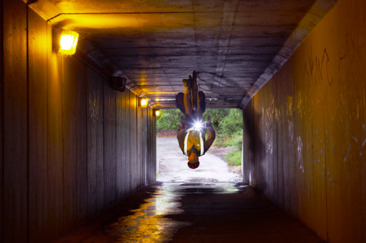
Consider the image below. Note the complicated lighting – 3 different side lights in the tunnel (and another behind the camera), plus light from the tunnel end; but the dominant light is the one at the top left of the frame. Lining up the objects, the shadow from the head needs to be hitting the lowest point on the right side wall; the cyclist’s body is shadowed to fill the whole side wall; the cycle wheels are shadowed on the roof. The lights further along the tunnel cast a shadow forward but much fainter, as they are further away. OK, this isn’t perfect (it was a quick play for amusement), but thinking about the imperfections will help you think about what I should have done with the shadows.
Rather than try to explain the mechanics driving photoshop (or your favourite software), I refer you in the Resources section to some useful guides online.
Resources
Here are some useful links:
Excellent idea to study the shadow by removing it from an existing photo.