

Colour is complex, and you can find hundreds of books on the topic and a search for “photography colour management” on a popular search engine found 121 million hits today. My notes here will be just a brief introduction. I will post more later in the Advanced Techniques section.
Think, for a moment, about the qualities of light. in the hour after sunrise or before sunset, sunlight is much warmer – yellows, oranges and gold, than in the middle of the day. The light from your old tungsten light globes (yellowish) is very different from your fluorescent tubes (greenish) or your Xenon strobe flash gun (probably “daylight” balanced). In photography we use a scale called Colour Temperature which approximates the colour of light from a heated filament at different temperatures. Think of the colours as you heat metal in a furnace – dull red at first, warming to white hot. Colour temperature in photography ranges along a yellow (cool, low temperature) to blue axis, and usually there is a tint control that adjusts colour on a magenta to green axis. Together these give a great deal of fine control.
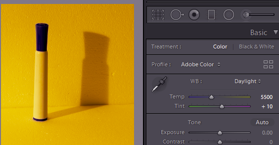
In your camera you will probably note that there is a “white balance” setting, which might be set at auto (camera will decide) or presets like “daylight”, “shade”, “tungsten” and so on. These controls do not affect what the sensor collects, but if you are taking photos in JPEG then they affect how the colours are translated from the sensor to the JPEG file. If you take RAW files, the colour balance setting is less important. All the sensor data is present in the file, and the colour balance setting just determines how these are translated into the displayed image. You can freely adjust the colour temperature (and tint) in your Raw processing software. If you took a photo in the middle of the day using, say, tungsten light setting, the image will probably look blue. Click the colour temperature setting in your software to “daylight” and the image will look more natural. The image below was taken with tungsten light. With tungsten colour balance (colour temperature 2850 Kelvin- the temperature of the filament in a tungsten lamp), the pen barrel and background look white/grey. With Daylight setting (5500 K, about the temperature of the Sun’s surface) we have a distinct colour cast. Note the eyedropper tool. Click on this and click it on the image where there is something that should be a neutral grey colour, and the software will automatically adjust the Temp and Tint over the whole image to make that area neutral grey. This is a great way to make a start on colour balance, especially where you have difficult light (assuming the image has some neutral grey objects to click on). There is also a dropdown selection of fixed presets or you can tweak the Temp and Tint sliders.
No matter what software you use, you will find colour controls similar to those in Photoshop and Lightroom. Below I will explain some of the features in the Adobe programs, but if you use something else, have a look because the controls on your software probably work in a similar way. If not, consult your software vendor’s website or the internet for instructions specific for your software.
Among the Lightroom Develop controls you will also find saturation and vibrance sliders. As the name suggests dragging the saturation slider to the left will reduce the colour saturation. At the far left you are left with a monochrome image. A slight reduction in saturation suits some images. Increasing the saturation might be of value where an image is looking very flat and dull, but take care. Saturation increases the intensity of all the colours in the image. Raise it too much and you can get clipping, where the colours are blown out. Vibrance is a bit more selective. It pushes the saturation in the areas of the image where the colours are more muted, but leaves the already highly saturated parts alone. Have a play with them on your own images to see how they affect the appearance.

The next tool to discuss in Lightroom is the HSL (Hue/Saturation/Luminance) control. The colour panel gives you hue, saturation and luminance sliders for Red, Orange, Yellow, Green … which allow you to tweak these properties in the image over the corresponding colour bands. Or, you can click the small direct adjustment tool (circle at the top left) then drag over a colour on the image to tweak the hue, saturation or luminance of just that colour range. Very handy.
Split toning allows you to change hue and saturation separately for the highlights and shadows. Consider a scene illuminated by a setting sun. The highlight areas will have an orange glow, whilst the shadows will be bluish as their light comes from the blue sky above. You can tweak, say, the shadow tones to make them less blue without altering the highlight toning. Or maybe you want to create a more golden-hour look on a midday photo. Adjust the highlight colours towards orange / yellow; maybe tweak shadows towards blue. Have a play to see what you can do.
The Tone curve control also allows you to make separate tone curves for Red, Green and Blue channels which also alters colour balance. However this approach can be difficult to get right, so I’d recommend sticking to the other controls mentioned before.
Local colour adjustments are also available using the brush or gradient tools to apply the colour tweaks to specific areas of the image.
In most image editing applications there are several adjustments for colour; I have listed the main controls here from the Adobe website :
Adjust Levels Auto Quickly corrects the color balance in an image. Although its name implies an automatic adjustment, you can fine-tune how the Auto Color command behaves. See Remove a color cast using Auto Color.
Levels command Adjusts color balance by setting the pixel distribution for individual color channels. See Adjust color using Levels.
Curves command Provides up to 14 control points for highlight, midtone, and shadow adjustments for individual channels. See Curves overview.
Exposure command Adjusts tonality by performing calculations in a linear color space. Exposure is primarily for use in HDR images. See Adjust Exposure for HDR images.
Vibrance command Adjusts color saturation so clipping is minimized. See Adjust color saturation using Vibrance.
Photo Filter command Makes color adjustments by simulating the effects of using a Kodak Wratten or Fuji filter in front of a camera lens.
Color Balance command Changes the overall mixture of colors in an image. See Apply the Color Balance adjustment.
Hue/Saturation command Adjusts the hue, saturation, and lightness values of the entire image or of individual color components. See Adjust hue and saturation.
Match Color command Matches the color: from one photo to another photo, from one layer to another layer, and from a selection in an image to another selection in the same image or a different image. This command also adjusts the luminance and color range and neutralizes color casts in an image. See Match the color in different images.
Replace Color command Replaces specified colors in an image with new color values. See Replace the color of objects in an image.
Selective Color command Adjusts the amount of process colors in individual color components. See Make selective color adjustments.
Channel Mixer command Modifies a color channel and makes color adjustments not easily done with other color adjustment tools. See Mix color channels.
More resources
- https://www.naturettl.com/lightroom-colour-correction-hue-saturation-luminance/
- https://digital-photography-school.com/vibrance-vs-saturation-in-plain-English/
- https://www.lightstalking.com/how-to-make-color-adjustments-in-lightroom/
- https://helpx.adobe.com/photoshop/using/color-adjustments.html
- https://www.digitaltrends.com/photography/photoshop-change-color-of-object/
- https://www.slrlounge.com/3-ways-to-adjust-color-in-photoshop-photoshop-tutorial/