
A commonly asked question is what subjects are best for monochrome? I have been casting my mind over this and I cannot give an answer. Thinking back over the last year, I have made monochrome landscapes, cityscapes, seascapes, portraits, photojournalism, nature … I don’t think I have made any monochrome abstracts lately, but then I haven’t made many abstracts of any sort recently , but swirling patterns of smoke might be good in monochrome, for example. So, I’m not sure it’s a question of what subjects should be in monochrome, as when would I make a captured image into a monochrome. Colour is powerful. We see the world in colour, and colour dominates many of the images we see. However colour can also distract our attention. A simple monochrome conversion is just a button click away, so it is easy to get a quick preview… for example in Lightroom I can create a virtual copy, convert to B&W (LR has a standard B&W, but also a suite of monochrome presets you can apply at the click of a button). Here are a couple of versions of a photo I took in Spain. In this case I thought the blue of the sky drew the eye away from the rest, so I thought the mono was a good option. I had a play on the mono version – selectively darkened the sky and strengthened the contrast (easy to do in mono), and lightened some of the detail in the canopy. I think the mono worked out quite well.

OK, that’s an architectural example. How about something different.
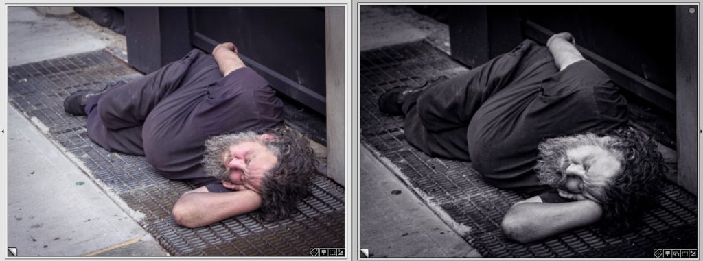
Here I think the skin colour warms the image; the mono version is harder, more gritty, better suited to conveying the hard life of the homeless man in New York.
Here is another reason to convert to mono:

In the colour version the bright colours in the background distract the attention from the story – the chainsaw racing competition. The blue marquee roof and bag in the background, the orange helmet, the red cowling on the saw and the red flash on the pants don’t add to the story. By converting to monochrome (and cloning out the other competitor on the right margin, I remove the distractions so you can focus on the story. You see better the spray of sawdust and the falling disk of wood.
Here is another, on a photojournalism theme – Sam Bell waterskiing at the Moomba festival in Melbourne in 2019.
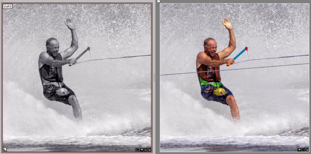
Again, I don’t feel the colours in the colour version add to the story. By converting to monochrome (and cloning out the other tow rope) I think the story conveyed is at least as powerful, though in this case I think it works in colour too.
OK, just for variety, here is another

In this case, the brightly coloured costumes are central to the story. Whilst the monochrome version depicts the scene, I don’t think it coveys the narrative as powerfully. Maybe I should try a version where I select everything except the dancers, and desaturate the colours in the background. This might help to focus the eye more on the dancers, removing the crowd as a background distraction.
Here is a landscape
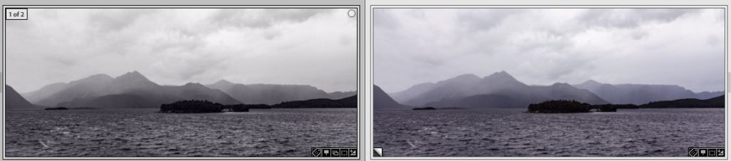
It’s a scene with virtually no useful colour – the tones and lines are the story. Monochrome is a perfect choice.
Whilst I have given a few examples here, I am not sure if there is an easy answer to what images make the best monochrome. But here are some rules of thumb to consider:
- Does colour add to the story?
- Are there colourful distractions that need diminishing?
- Is the story of the image in the lines and tones?
- Could a monochrome conversion add drama to an image?
These examples have all used conversion to Black and White. You can also make monochrome with different tones – sepia (warm tones) and cyanotype (cold tones) are two examples. These tinted conversions can convey a mood or tone, perhaps, better than plain B&W. Again, experiment and see what you like. Also look at other people’s images – what monochrome conversions have they used? what toning? Learn from examples.
As with many such questions, there is no one answer. The best bet is to experiment with your own images and see what you like in Mono vs colour.