
In this section we will cover the basic tools you will use to process your image.
In this section we will cover the basic tools you will use to process your image.
Workflow describes the overall processes you use between retrieving the image from your camera to your finished image. It includes:
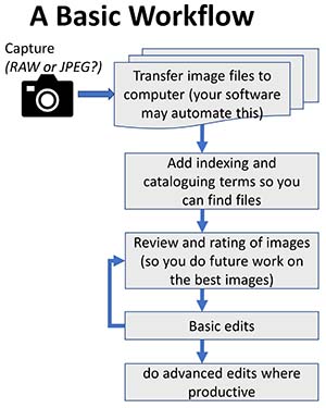
How you set up your workflow is a very personal thing, but if you do it right your work will be more efficient and it will save you hours and hours of time and frustration. The links below will discuss some of these aspects in greater detail.
These are very brief notes in response to a query. I will probably update when I have more time.
When I make a focus bracket series, I usually have some images at the beginning and end that are focused too close, or focused too far. In some cases you may have things in focus at the extremes, but you would prefer these to be out of focus to draw the eye to particular areas of the subject, rather than have all of the subject pin-sharp. It is easy to scan through your focus sequence images to see which ones you want to include.
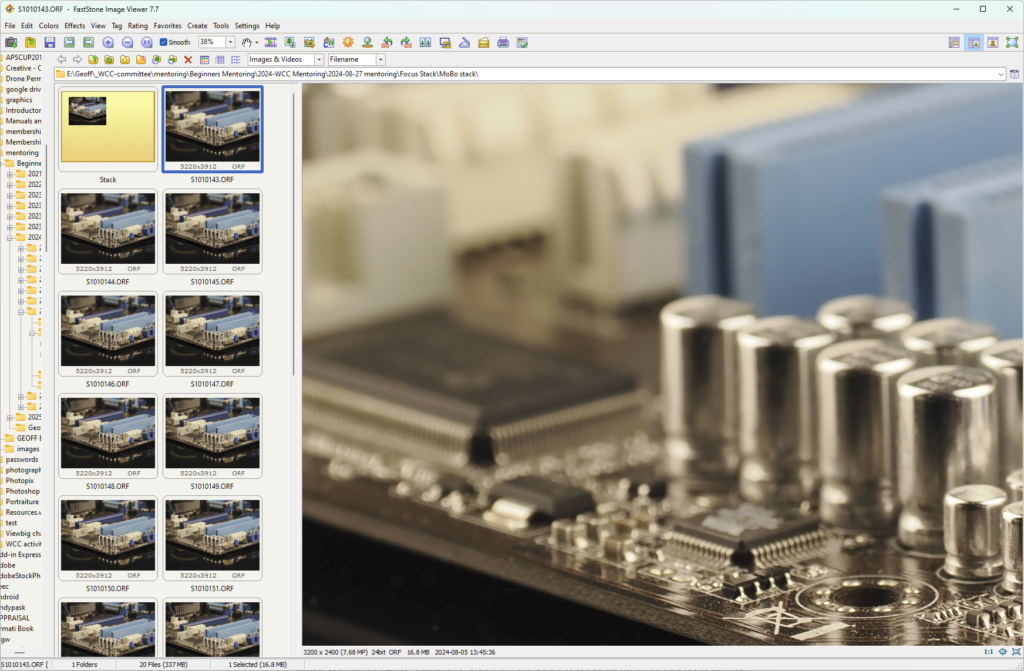
Because focus brackets can generate very large numbers of RAW files, I generally don’t import these directly into my Lightroom catalog. I process the stack and import that (keeping a backup of the original images in case I need to go back and re-work the stack).
I like faststone image viewer (https://www.faststone.org/ windows only) to skim through the focus stack. Faststone works fine on RAW files. In faststone clicking on the image instantly zooms to 100% on the area you clicked and you can click and drag to scan across the whole image. Very handy for checking for sharpness across the image. There are lots of other programs that give similar functionality.
For stacking I use Helicon Focus https://www.heliconsoft.com/heliconsoft-products/helicon-focus/ which I find excellent. It is very fast. Zerene stacker is another excellent product with similar features. It may give slightly better stacks for some sorts of images, but it is considerably slower. Photoshop has some stacking functionality, but much less capable with complex subjects – it can auto-align and auto-mask, but if you need to tweak the masking it is a nightmare. Helicon and Zerene make post-stacking adjustments easy.
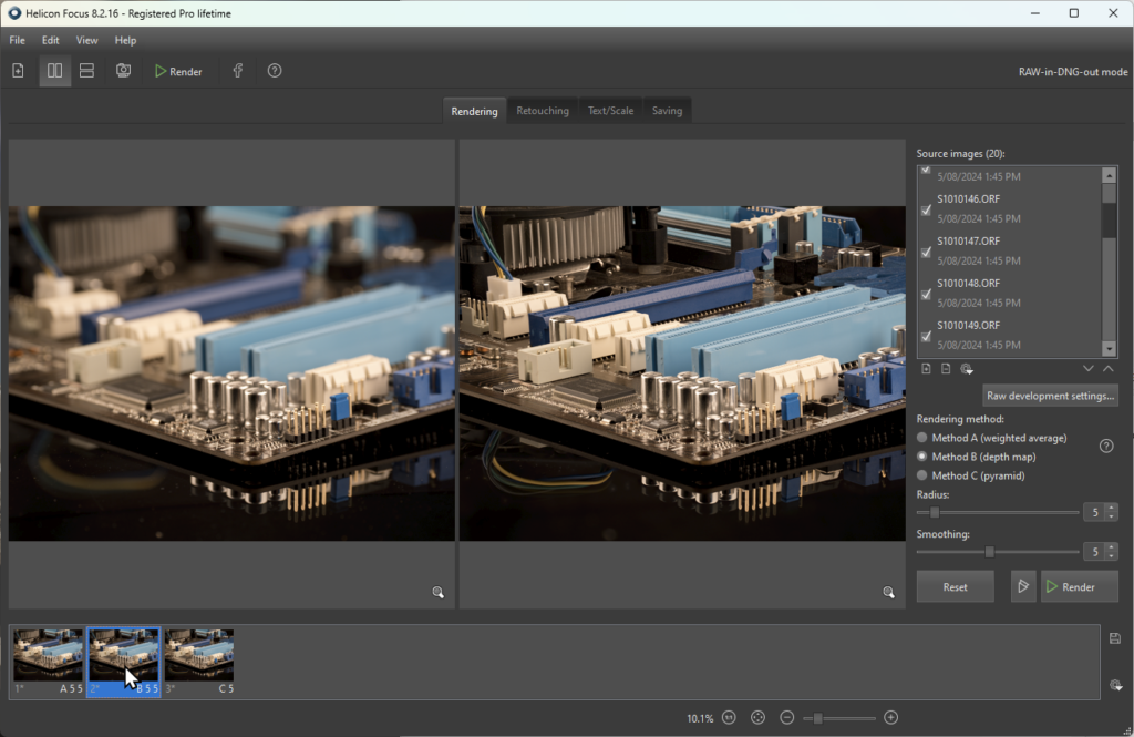
So, generally, I drag the set of raw images I want to stack onto the Helicon window. It quickly digests the raw files and presents a list of source images on the right and a rendered image on the left.
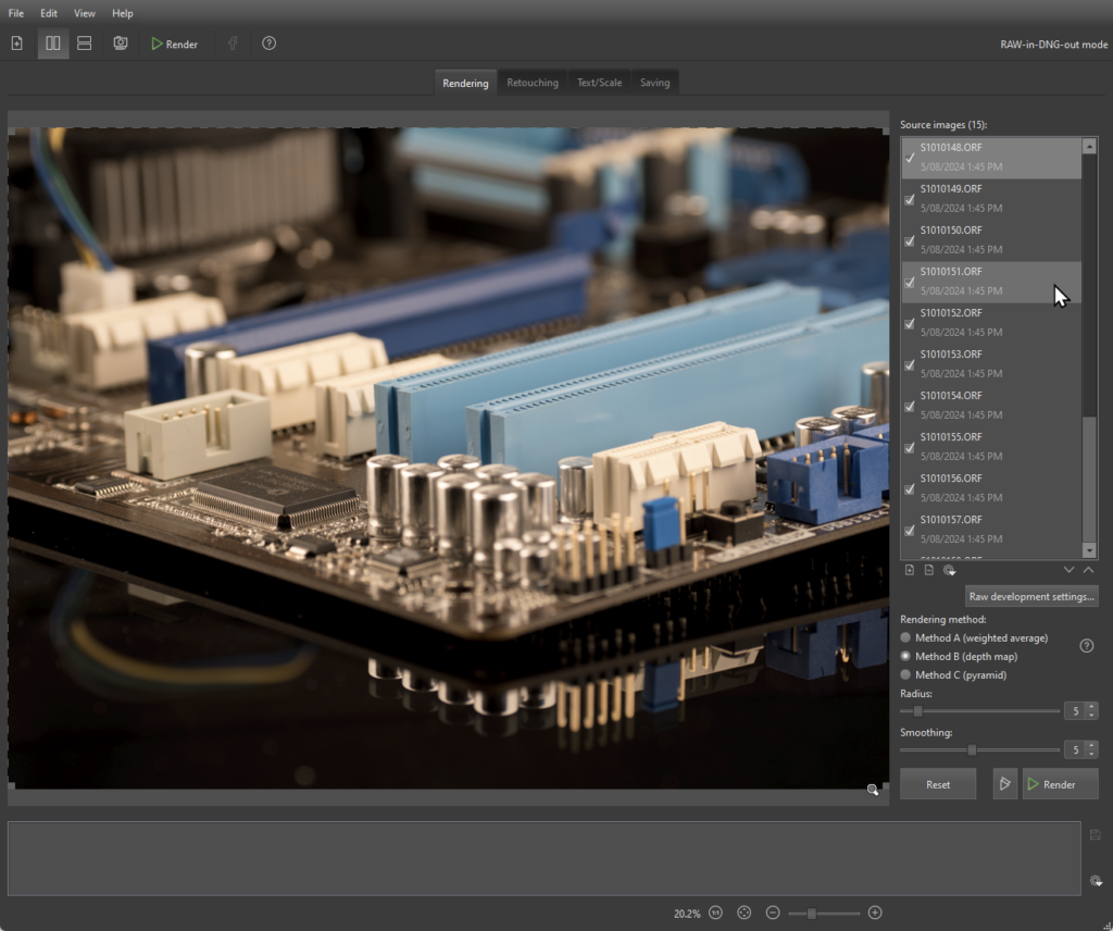
You can click the source image list to view any of the files; you can zoom in to see the detail on each image; you can select/deselect source images to include/exclude from stacking. Once you have decided which images to use, choose a rendering method. Helicon gives useful guides on which method to use for different subjects, or just play, try them all out, adjust the parameters, and click the Render Button. With the 20 images in my test stack rendering takes less than 10 seconds, so you can afford to experiment. This isn’t a press the button and “go away for a cup of tea whilst it works” sort of program. Each rendering will give you an image in the right hand panel that you can browse/zoom etc to see if you are happy. thumbnail at the bottom that you can click to select so you can browse and compare.
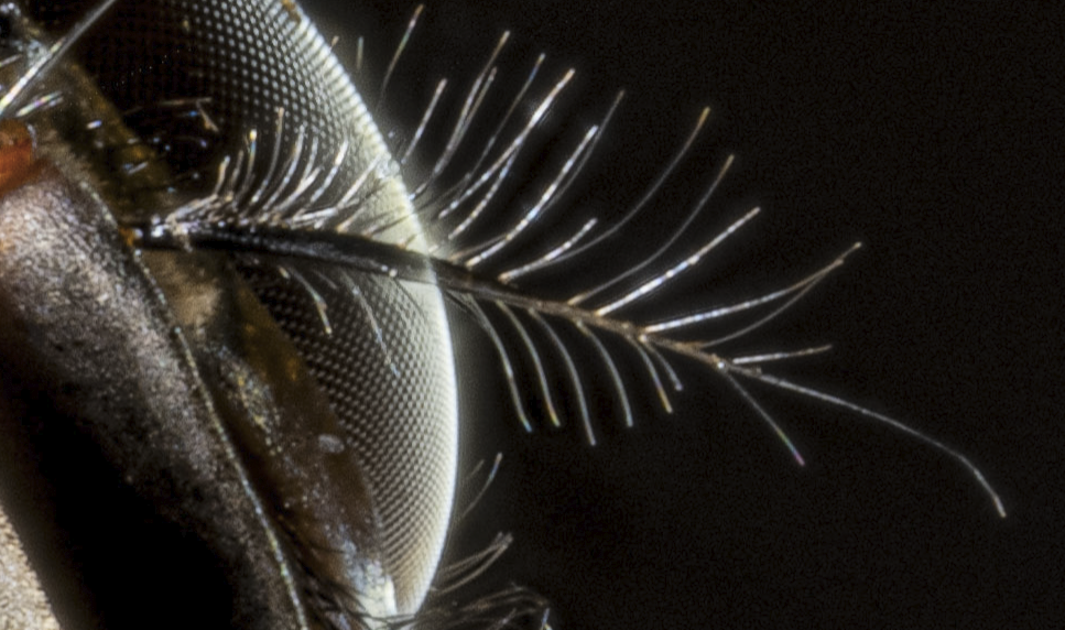
Quite often my stacks need some extra attention, particularly with complex subjects with many overlapping elements (eg hairs, antennae etc). Focusing on the surfaces behind the antenna for example, you will find that the out-of-focus antenna obscures an area. Or out of focus elements might bleed out over the background. You can see that in the image below. A defocused highlight from the edge of the eye of this fly is lightening up the otherwise black background. There are also glitches in the hairs where they cross the edge of the eye.
These sorts of artefact are relatively easy to fix (albeit somewhat fiddly) with the “retouching” tools in Helicon where you can copy from a selected source image (here you would choose a source image where the eye edge is in focus, then paint in the areas where the rendered image shows the out of focus. Or you can clone from different areas etc etc. See the Helicon documentation if you want to find more. Zerene has similar retouching tools.
Anyway, back to workflow, once I have stacked and retouched the image(s) I save to a TIFF and then load that into Lightroom. Just saving the processed image saves a lot of disk space on my main drive. If I think I might want to come back and reprocess, I will save the original RAW files onto a backup drive. I can easily find them then by date or file name.
Helicon Focus has a 30 day free trial. I think Zerene does too. There are a variety of other packages like combine ZP (free) that also stack, and focus stacking is a feature in a variety of other software like Photoshop.
In summary, my workflow is:
Making photobooks or calendars for the first time can be daunting. There are many suppliers, all with their own systems, usually either a desktop computer application that you download, or an online web-based system. In my experience these systems are often quite clunky, particularly if you want to make complex layouts with multiple images, text boxes and layout elements (borders, drop shadows etc). What I realised was that you can avoid most of the stress by using layout software you are probably already familiar with, namely Powerpoint (or LibreOffice Impress, a free alternative to PP).
My approach is as follows:
A couple of things to consider.
Sometimes the nominal page size doesn’t actually match what you get back. For example an A5 soft cover book I made once had finished pages that were 20 cm wide not the 21 cm you might expect. I guess something was lost in the binding/trimming. Luckily I allowed enough margin that it wasn’t a problem. These days I generally open the online page design software and do a screen grab (see below). I can then measure the dimensions of the page on the screen grab in pixels and use the width/height ratio to set a more accurate page dimension in PowerPoint/Impress (or just measure it on your screen, assuming your screen has square pixels).

Depending on the provider and how their software works, it is sometimes easier to make the Cover in a separate file that has pages about twice the width of single pages. Then I can add text lettering on the spine in the centre of the page, as well as the front (right hand side) and back cover (left hand side). Place this double width image on the Cover layout page and drag it to fill the double page spread. Alternatively, in some software it is easy just to add the text as a text element separate from your page layout, in the central column (the software will probably give you a placement guide on the layout page)
You may want to have images spread over two pages. Bear in mind that unless you are ordering a “lay-flat” book, you will lose some of your image in the binding (see image above). If you want to minimise the number of images you have to add to compile your book, you could also make all the “pages” double width, leaving appropriate gaps for the binding in where you position your text and images. then place the double page spread image to fill the double page layout in the software. Note that if you want page numbers, it becomes a challenge, as the automatic numbering won’t give you sequential numbers on both sides of your double spread layout.
There are lots of printers out there. I generally use BigWPhotos or HarveyNormanPhotos (both use the same Fujiprint systems), as they are very cost-effective if you wait for specials (fairly frequent). Delivery to a local store is free which cuts down the price too – it makes a difference if you make lots (I make several dozen calendars each year for family, friends and neighbours). Photobookshop.com.au offers similar quality (if you choose the more expensive paper option) They do put intrusive self-advertising barcodes on the front of their calendars. Photobookshop generally include postal/courier delivery in their prices. There are a wide range of other printers, with a range of prices and quality, but I won’t comment on any others as I have not tried them out.
My experience with the printers I have used is that if something is mis-printed (misalignment, colours wildly inaccurate etc) they will repeat the job for free so you get what you paid for. Caveat – these comments are my experience up to the time I write (2025) and things may change in future. Caveat emptor — it is often a good policy to search out reviews/feedback to see what the consensus is on any particular supplier (but look out for fake reviews).
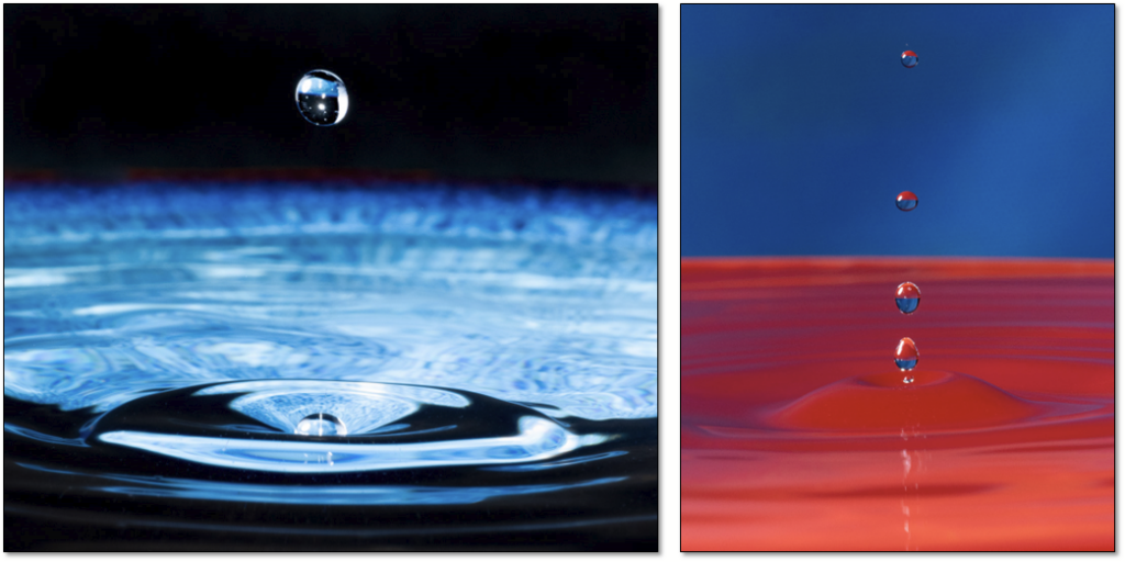
Here is a simple DIY project, a DIY water drop apparatus to get photos of splashes. I devised it for a workshop I gave to our camera club and decided to document what I did. Of course you could buy commercial products that are much more versatile (eg Pluto Trigger or MIOPS trigger), but they will set you back several hundreds-of-dollars, rather than this DIY approach that will cost you at most several dollars.
This is not a blueprint on how YOU should make it. I made the rig with bits and pieces I had at home. The general idea should point you in the right direction for you to recycle bits and pieces you have, or beg/borrow/buy cheap bits to complete it.
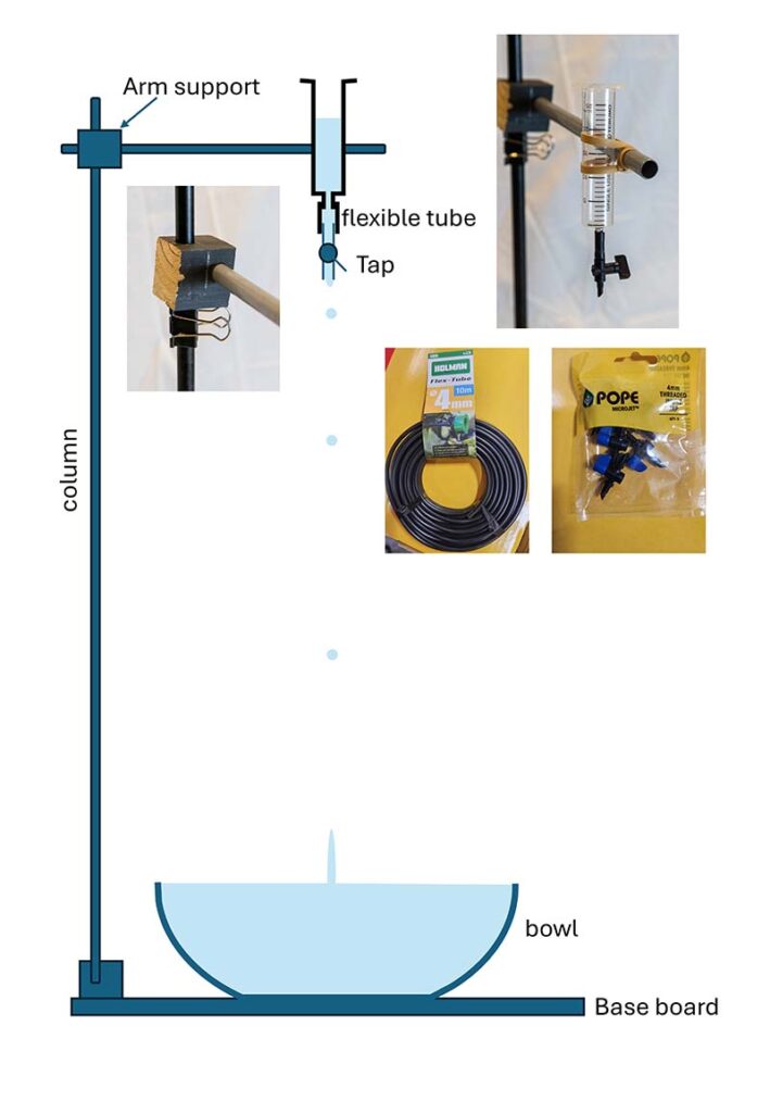
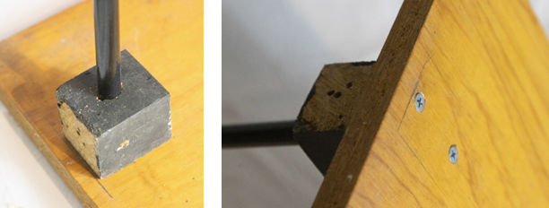
The base board was a piece of plywood – a piece of an old shelf. The column was a bit of alloy tubing from an old clothes airing rack that I dismantled. You can buy similar aluminium tubing or wooden dowel at hardware stores for a few dollars. I connected this to the base board with a block of wood with a hole drilled to hold the column, and screwed to the baseboard from below.
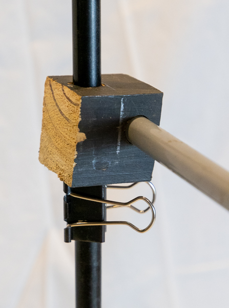
To hold the side arm I drilled holes in a cube of wood at right angles. I used a bulldog clip to stop the block sliding down the column. This allows easy adjustment of the height for the drop. You can use the same sort of tubing for the side arm as the column; you can adjust how far the side arm projects by sliding it within the block. If it rotates when you load the water you can fix it with sticky tape, or put in a screw through the wood block to fix it in place.
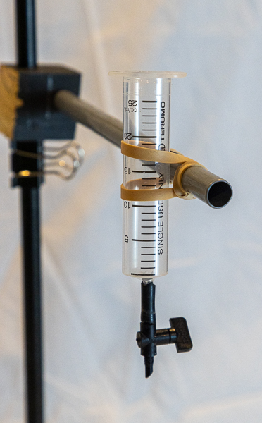
I used a 20 mL syringe (I happened to have some at hand, but you can probably get them at a pharmacy), and used rubber bands to hold it against the side arm. From the nozzle (Luer slip tip) I put a small bit of flexible garden dripper tube to connect it to a small inline dripper tap, so I could control the flow. You might be able to avoid the syringe and flexible tubing if you use a small disposable water bottle. You might be able to punch a small hole in the cap to allow you to screw the dripper tap in. Cut off the bottom of the bottle, screw on the bottle top with tap, invert and see if it works. You may need to use sealant to avoid leaks between the tap and the bottle cap. Or even just make a pin hole in the cap and see if you get nice drip rates (small holes give slow drips; start small and work up until you have the drip rate you want. Another alternative is to use a siphon to deliver water to the dripper tap.
Another suggestion is that aquarium shops sell small adjustable valves (taps) for aquarium air-lines, so you could probably use one of those instead of a drip-irrigation tap.
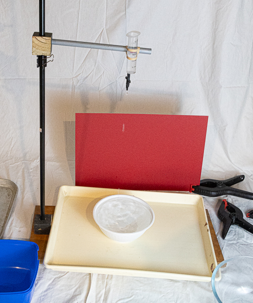
Use a drip tray (there will be lots of splashes). Place a bowl on the drip tray under the dripper, and fill it with water. In the illustration I have used a white takeaway bowl, but feel free to experiment with coloured bowls or clear glass bowls. Place a background (far enough back to avoid splashes unless you are using, say, coloured fabric that won’t mind getting wet).
Now you are ready to play. Let’s discuss camera settings.
Since the drops are very dynamic you will need a very short exposure time. The best way is probably to use flash. On my Canon 580EX at 1/8 power the flash duration is about 1/4000 which is enough to freeze the motion of the water droplets and splashes. Set the camera to flash sync speed (eg 1/250 sec, depending on your camera). There will be some movement of the point at which the water drop lands (depending on random movements as the drop forms, air movements, distance from dripper to bowl etc), so I use f16. Set ISO 200 as a starting point, and flash on manual at, say, 1/8 power. Adjust the flash power and ISO as needed to get optimum exposure.
If you are not using flash you will need powerful continuous lighting to enable fast shutter speed (say 1/2000 sec as a starting point, but experiment) which will probably necessitate higher ISO settings. Adjust your settings to get appropriate exposure. With continuous lighting you will be able to use High Speed “motor drive” to get a sequence of shots, which may allow you to use slower drip speeds and still give you usable splashes in each burst of shots.
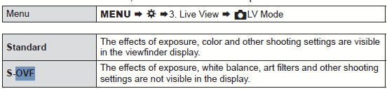
To avoid unwanted camera movements use a tripod. Focus on where the drops will land. If you are using a mirrorless camera you may need to change the viewfinder settings. Often it is set to display the image as it would be captured on the sensor, which is fine for ambient light, but if you are using flash, you may find the viewfinder is very dark since the main light (flash) is not illuminating the subject. You will find somewhere in the menu there is a setting to emulate an optical view finder so you see the subject in reasonable exposure. On my OM1 the menu is shown below, but the menu set-up, and exact terminology may vary depending on your camera brand and model.
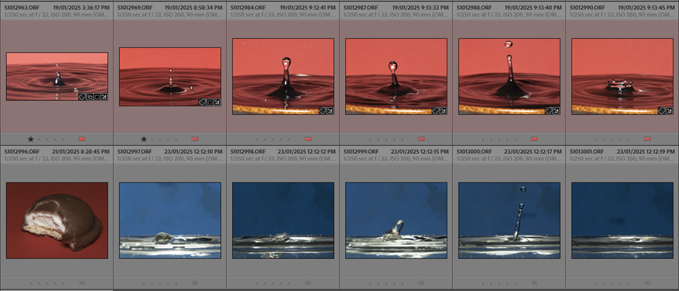
Once you can see the subject, use manual focus to get the area where the drips land in focus. Now you can start to get photos. It is hit and miss. Remember to wait for the flash to charge before releasing the shutter or you will get blank images. Adjust the drip rate with the tap. If the drips are too infrequent you may get many “misses”. If your drip rate is too high it may get messy with multiple splashes in exposures (but that may also give interesting effects). Below are thumbnails of some of my better images (about 1 in 10 of the exposures I took (and a biscuit I chomped on between sequences).
If your flash has a “strobe” function that operates fast enough (multiple sequential flashes in a single exposure), you might try that to see what effects you get (may need to use a longer exposure time). Try adjusting the height the drips come from to see how things change. Play with different backgrounds; perhaps use a different coloured/patterned bowl. Maybe colour the water with food dye. Maybe colour the drip water but not the bowl. Maybe drip into milk … Experiment.
Hope it all works for you. Let me know if you have problems.
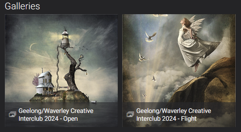
Adrian Donoghue kindly judged the Waverley-Geelong Creative Competition (gallery at https://waverleycc.smugmug.com/Presentations-and-Events/Geelong-Waverley-Creative-Interclub-2024)
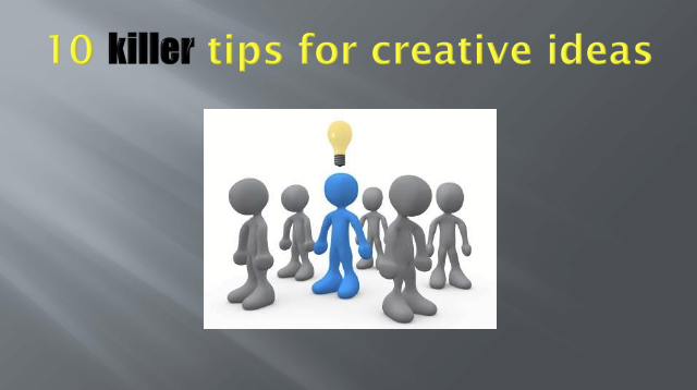
He followed this with a presentation on his notes from his presentation “10 killer tips for creative ideas”. He has generously provided his notes that you can download from the link below.
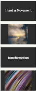
Ewen broke the mould with his judging for our monthly competition (set subject ICM), turning it into a very educational presentation highlighting concepts that he illustrated using a selection of the entries.
His presentation slides can be downloaded from
https://www.dropbox.com/scl/fi/nai1n0ug2rui0qsmiuk7t/WCC-ICM-2024.pdf?rlkey=4rouxml3h3vh11x8fc3wlgnp6&dl=0
He also has provided comments on many of the individual entries that you can view in the monthly competition galleries on SmugMug (Intermediate Print, SetSubject and Open; Advanced Print, SetSubject and Open)
He showed us A0 prints made from 12 megapixel JPEG images, that he had upscaled using Upscayl, a free, open source, AI based program for increasing the pixel count of images. There are desktop versions for Windows, MacOS and Linux. https://upscayl.org (see video link How Big is 12MP below). [Note: there are other alternatives – Photoshop (current version) does a very reasonable job; Gigapixel from Topaz Labs is excellent and there are others – https://www.howtogeek.com/868512/how-to-ai-upscale-an-image-or-video-8-best-tools/ gives some other options.]
Plus he gave us a few YouTube links that might be relevant:
Processing and printing A0 from 12MP using Upscayl
ICM with Moving Prayer Wheels
Finding a path to creativity with the camera
Ewen also has a lot of lovely material on his website at ewenbell.com and his YouTube channel https://www.youtube.com/@EwenBell
Our Creative SIG presentation 09 April 2024 was by Suellen Saidee Cook, who joined us by Zoom from her home in Tasmania. She creates imaginative composites with strong narratives.
Cook’s style is mysterious, enchanting, whimsical and emotive, with threads of melancholy inviting feelings of having been left outside the boundaries of the image. She seeks to make the viewer of her images an observer who is projecting their own emotional response into the image, creating a story of what they see and feel.
https://www.capturemag.com.au/profiles/suellen-saidee-cook
She is winner of multiple awards for photographic excellence.
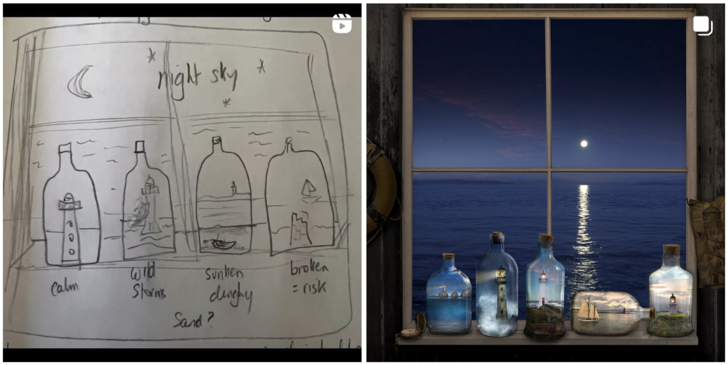
In her presentation she talked about her creative process. The image below illustrates the concept on a page in her journal, and final outcome for her image “Two Minutes Past Twilight”. She provides a partial step-through at this link https://www.instagram.com/p/C2F_64ASjfd/ so you can see how the image progressively developed.
It is well worth while exploring more of her work at https://www.suellensaideecook.com.au/, https://www.facebook.com/SuellenSaideeCook/, and https://www.instagram.com/suellensaideecook/ .
Suellen discussed some of the technical issues in generating her images using photoshop, and recommended the Photoshop training videos by Jesus Ramirez at https://photoshoptrainingchannel.com/
A recording of Suellen’s presentation will be made available for a couple of months. An email with details will be emailed to members shortly.
Suellen’s selection of 10 artists whose images have had an important and positive influence in her creative life and on her artistic journey: https://www.suellensaideecook.com.au/studio-notes/2019/12/2/my-top-10-image-makers
This is the home for the WCC Creative SIG in 2024. It will be updated as new material becomes available.

A recording of the Feb zoom meeting is available via youtube at https://www.youtube.com/watch?v=3rZde0Rc5XU.
The February meeting included a run down on 2023, presentations from Helen Warnond on Creativity (presented by Jen Fawkes), Creative Blur (presented by Jen Fawkes), and a focus on Shirley Steel’s work (presented by Jenny Adams). Paul Spence then outlined his plans for the meetings he will run in the remainder of the year. Paul will be focusing on inspiration and creativity rather than techniques for image editing and compositing:

The subsequent meetings took a variety of forms. A few resources are linked below for meetings where relevant.
We had a fantastic day-long workshop on Jan 7th 2024, presented by Sharon and Rob Prenton Jones https://www.prentonjonesphotography.co.uk/news/live-workshop-in-australia/. They covered a range of topics including (apologies if I have forgotten any major topics – a lot was covered):
Links to many resources detailing these topics is at the end of this post.
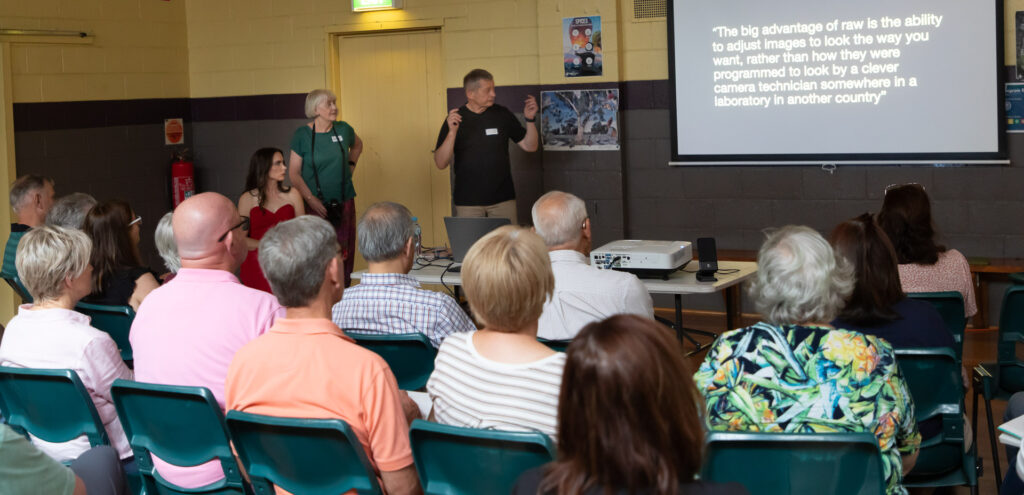
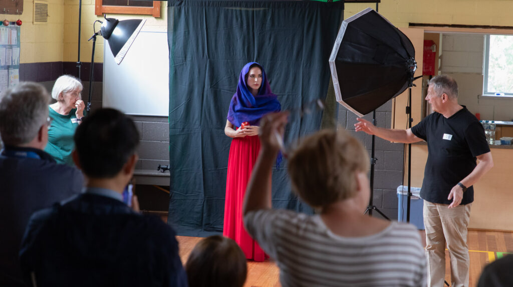
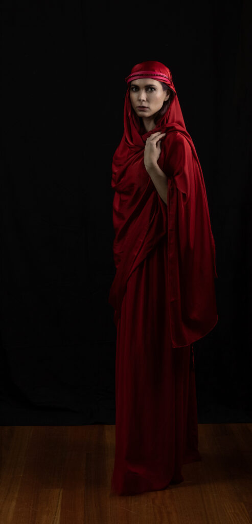
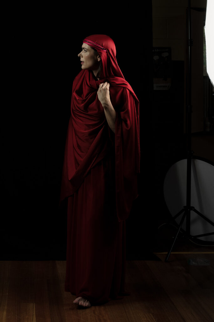


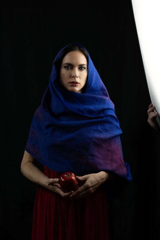

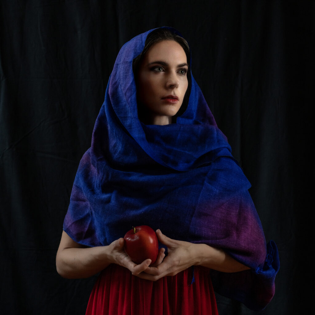
Here are a couple of images that Sharon Prenton Jones worked up, using the portraits of Loren, that she took during the workshop. The second image, given the title “Aurora” earned Sharon (well deservedly) a PSA Gold award in the 8th International Salon Unlimited Photo 2024 (Sharon also got two other gold awards, a merit, and 12 other acceptances in this Salon!)
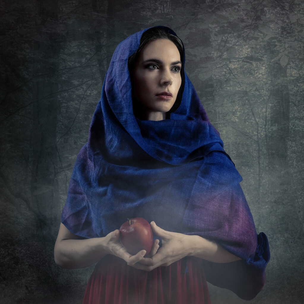
Our heartfelt thanks to Sharon and Rob for an illuminating session and to Loren for her modelling skills.
More resources from this workshop will be linked below as I get round to them:
Sharon and Rob sent a host of useful guides that I have converted to PDF format and uploaded. You can download these guides from the links below.
Sharon: Matching Colours Movie (also linked HERE with some introductory notes)
How I use Photoshop’s Camera Raw Filter to add light to faces
Often, when you are compositing images the colours of the two (or more) source images may not match. Perhaps you have a model taken under studio lights that you want to layer onto a background with a different colour balance. There are several ways to achieve a better colour matching. Here is one, presented to WCC by Sharon Prenton Jones (https://www.prentonjonesphotography.co.uk/) who kindly sent us a movie explaining her technique.
Just click on the image below to play the video:
Mist can enhance some images, and adding a misty effect in Photoshop is not difficult. Here is one approach, based on the method demonstrated by Sharon Prenton Jones at a WCC workshop, Jan 2024. In this work through I am using Photoshop, but the same principles apply with most similar alternatives that provide for layered images.
Note that there are many alternative approaches, such as using a custom brush to apply a mist effect.
Let’s do this with an example. This is a quick edit, not meant to be perfect, but to show the process. I leave it to the reader to perfect the process on their own images.
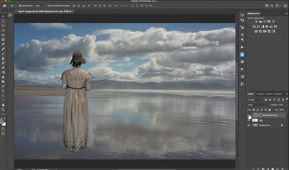
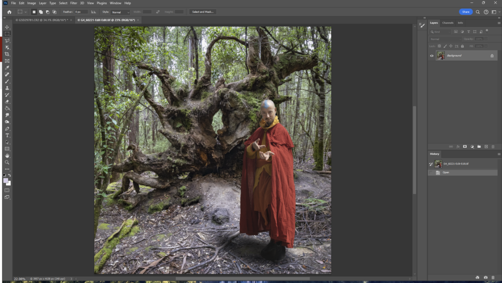
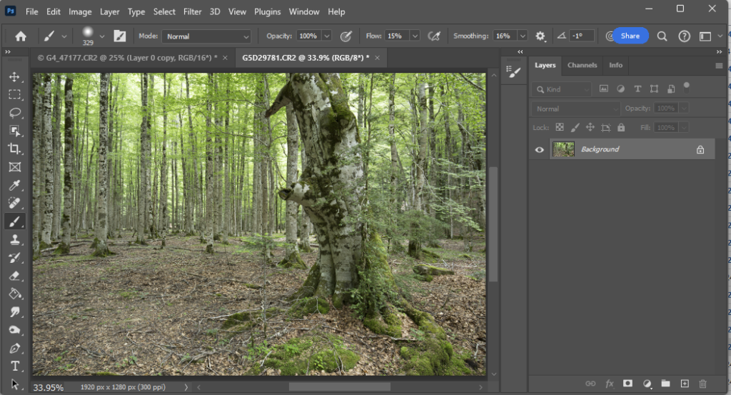
Here is a starting image (here I have composited the wizard onto the forest and added a shadow to “ground” the person:
First, add a new layer (Shift-Ctrl-N). Change the name to “Mist 1”, so you don’t lose track of what your layers represent. Maybe reduce the zoom a couple of steps (Ctrl-minus) in preparation for the next step.
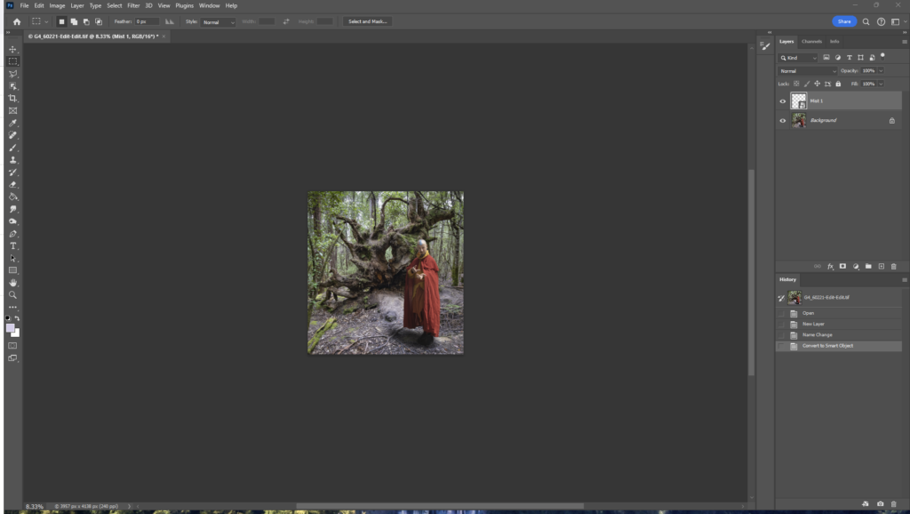
Now add a “cloud” pattern. In Photoshop you can use menu: Filter>Render>Clouds. This will add a speckled black and white pattern over your background layer. Alternatively, use your own starting pattern (see below).
Use Transform (Ctrl-T) and drag the corners out to spread out the pattern (this affects how granular your mist effect looks).
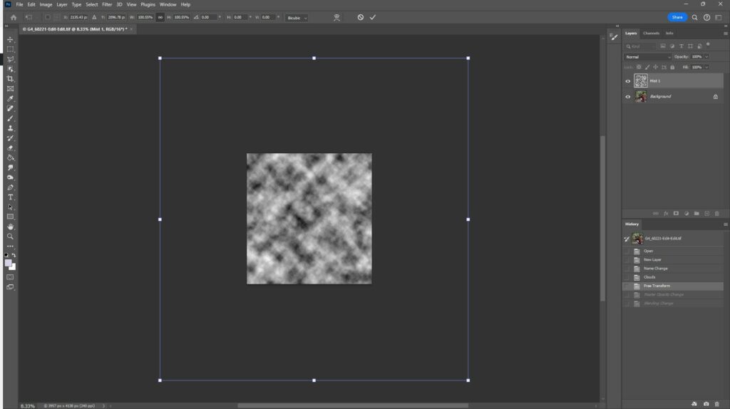
Press Enter to complete the transform. Set the layer opacity to a lower number – I have set to 45% here as a starting point, and set the blend mode to screen

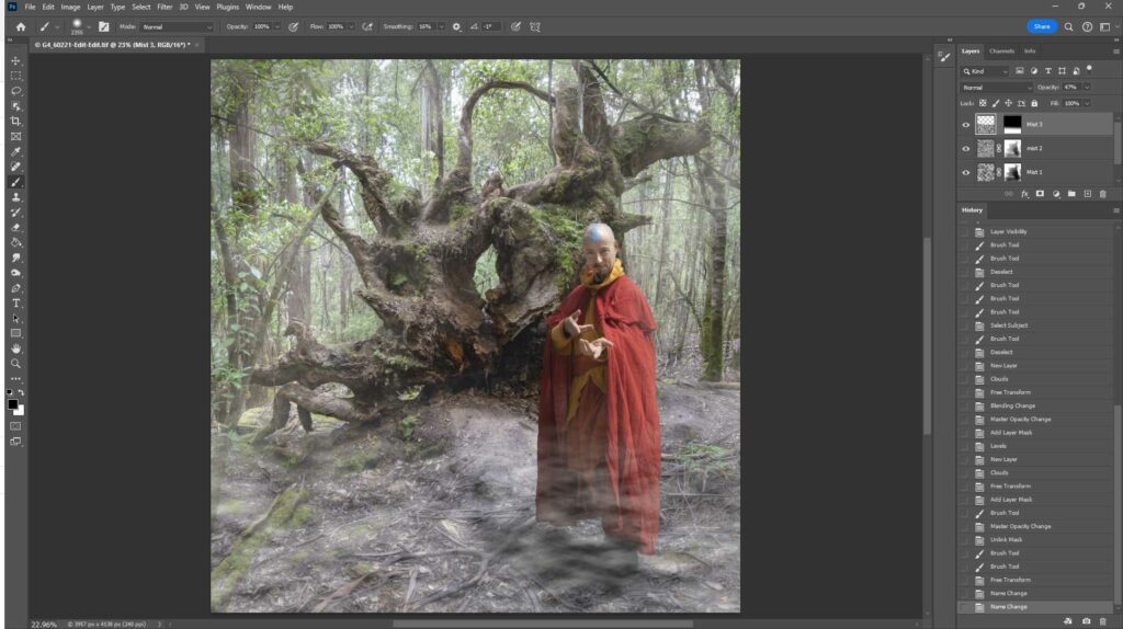
Now we are getting the start of a mist effect, but we need to refine it. The further away things are, the thicker the mist effect, and probably there is more mist lower down than higher up. This is easy to achieve using layer masks (and perhaps more mist layers to be added). So, add a layer mask and paint with black (use a soft brush with low flow) on the mask to reduce or remove some of the mist – for example paint over the wizard; a little less on the tree root … closer things like these and the foreground ground will need less mist to be convincing. Perhaps add a second mist layer to add an extra depth… Maybe add another layer masked at the top to add a bit of low mist over the ground … Tweak the opacity of the layers… have a play. Try with different starting patterns. I don’t think Photoshop’s render>clouds ideally mimics real mist (see below for an alternative approach), but if you do use it, try stretching the pattern laterally using Transform; maybe try a linear blur or other distortions; using multiple layers to build up the mist effect better reflects reality – but use masking to restrict some layers to the far background whilst others will reflect closer mist with appropriate masking; alter the granularity/texture of the further mist layers – further away should have smaller texture than close up; tweak the opacity of the layers to get the effect you want. The example below is far from perfect, as it was made as a quick example to demonstrate the technique.
Here is a before/after of the image – slide the middle bar left and right to change what you see.


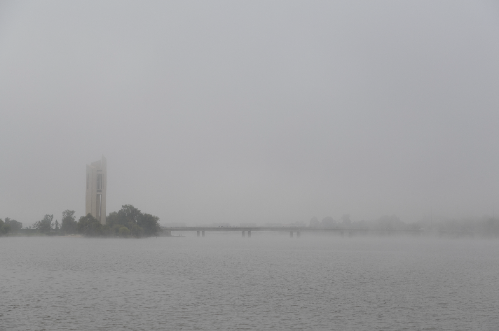
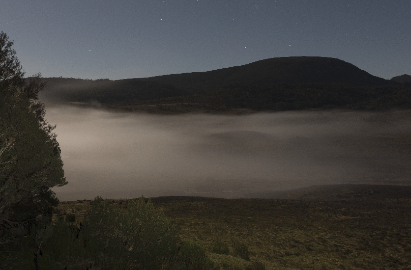
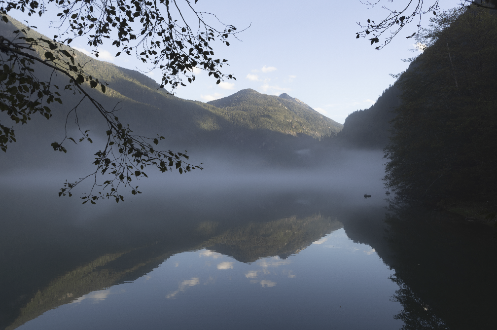
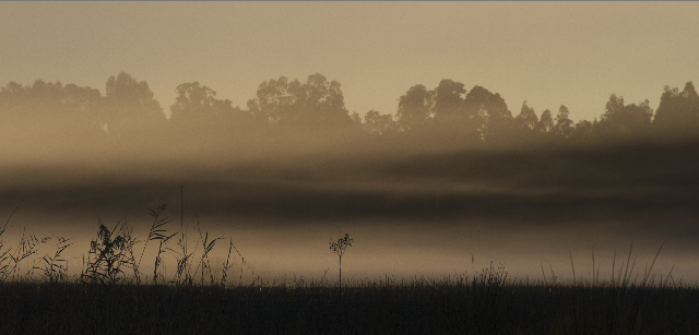
Spend some time in misty places to observe how mist looks as it wraps round objects and recedes into the distance. There are different sorts of mist: think of the thin, ground hugging mist layer over a sports ground on a crisp morning; or the dense, featureless mist as a cloud envelops you on a mountain peak; or thin tendrils of mist weaving through a forest on a crisp winter morning. Some mists hug the ground; other times the mist will envelop the tree tops but leave the ground clear; and sometimes the mist is everywhere. What sort of mist do you want to generate? I have put some (not exhaustive) examples below.
Experiment with different starting points. Above I have suggested using Photoshop’s Filter>Render>clouds. Try tweaking this by stretching the pattern horizontally, distorting the pattern using warp, liquefy etc to get a different texture (probably more like real mist).
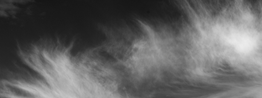
Maybe take a picture of wispy cirrus clouds (convert to B&W and adjust the conversion so that the blue sky becomes black with grey-white clouds – the black background will disappear when the layer is later set to blend-mode screen leaving you with just the grey to white cloud pattern forming the misty overlay). Here is an example – I edited a cloud picture, convert to B&W with blue luminance dropped, then used curves to push the open sky to black and the clouds shades of grey up to white.
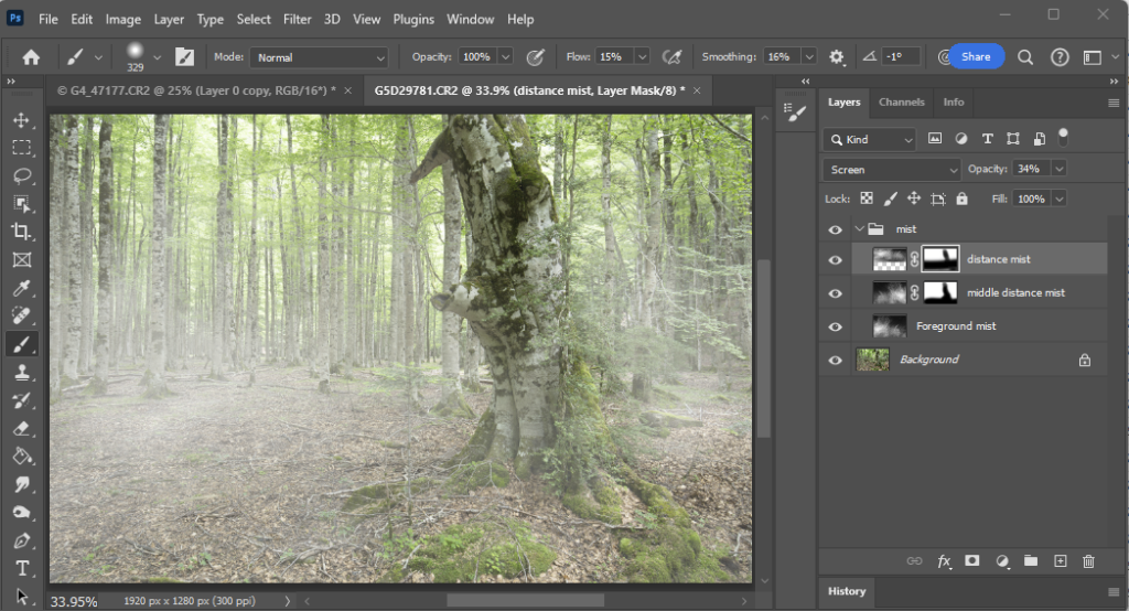
Then I added this over my forest image as 3 layers (Blend mode Screen; and I started with opacity 30% in this example; adjust to suit your needs depending on the particular images you use) for foreground, middle and distance, each at a different scale, (transform and drag corners for size, flip horizontally for one or more, move around to put the cloud overlay at suitable places so the 3 layers are all different in size and position). I masked the layers. Distance got the foreground ground and closer tree removed; middle got the tree and a little of the nearest ground masked; foreground mist has no mask. To be tidy I grouped the 3 mist layers into a group, and all the layers were given appropriate names so if I come back another time and want to play with the layers, I will know what all the layers represent. Save as a layered TIFF or PSD file, so you preserve all the layers for future edits.
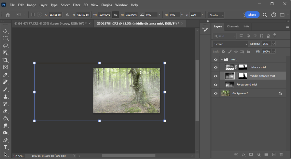
If you want to tweak the appearance, there are a few options. Adjust the opacity to increase the density of the mist (you can have different opacity for each layer if that suits your needs); click the chain symbol between the layer image and layer mask to decouple the mask from the image. Now you can use Transform (Ctrl-T) to move/resize/distort the mist image layer without altering the layer masking. See how the mist appearance changes as you move or alter the mist image.
If you add another image (maybe a knight in shining armor in the middle distance would fit this background image) you will need to put that layer behind the foreground mist layer and in front of the background mist layer; or you could put it behind all the mist layers and adjust the masks (more work that way) … anyway, I am sure you can work it all out.
And remember that mists are not all the same. Here are some examples:
Have fun with your experiments.