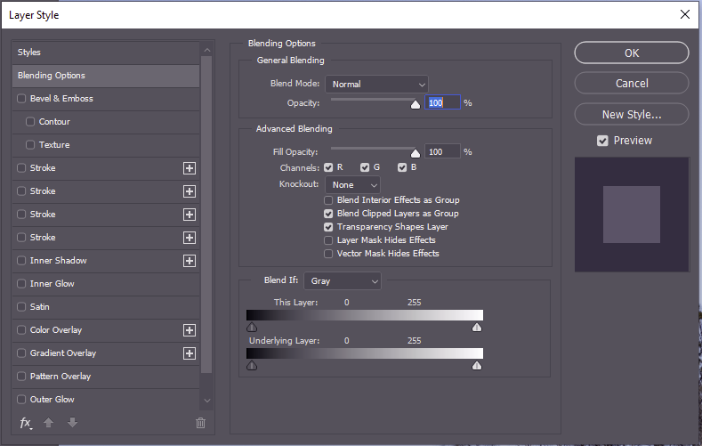
Blend if is a powerful tool in the layer properties in Photoshop (other software may have similar functionality – explore your documentation). Open the layer properties and you find an Advanced Blending block and Blend If block in the central column. You can use this to selectively define which parts of a layer are “blended” with underlying layers.
You can apply Blend-If to image layers. With Blend If can, for example, replace a blue sky with another layer without having to make complex selections or turn a green-screen transparent so you can see an underlying image where the green screen shows on the top layer.
You can apply Blend-If to adjustment layers so the adjustment selectively applies to parts of the underlying image (for example to darken a sky with an exposure adjustment that applies only for blue areas, or to bring up the shadows by applying an adjustment only over the darker areas.
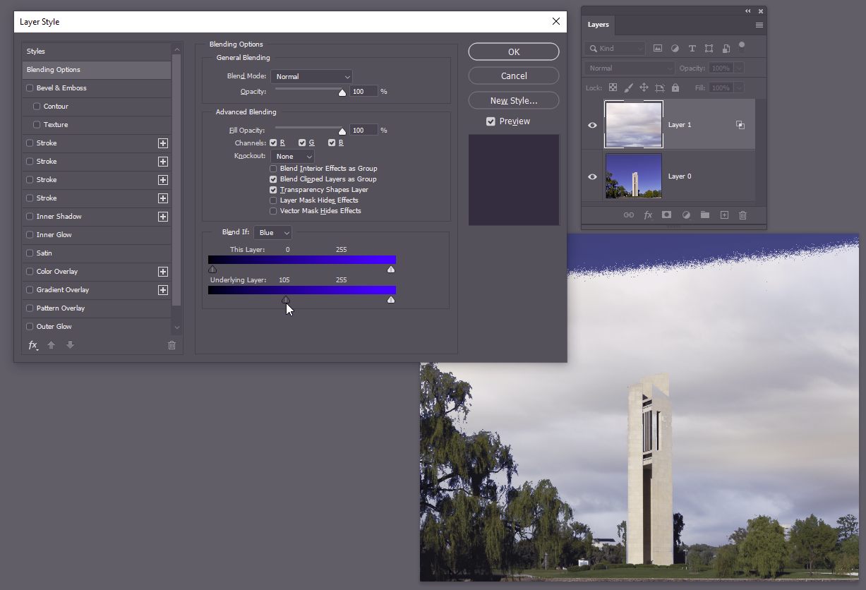
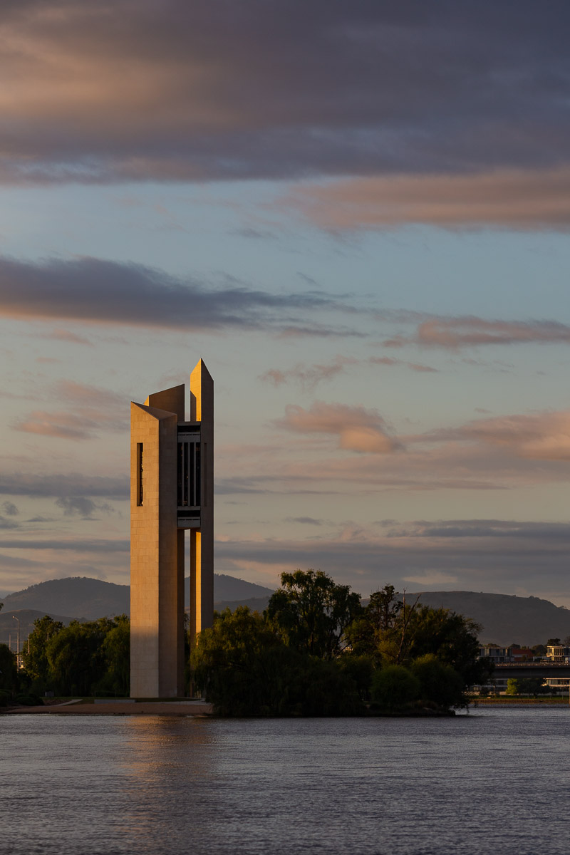
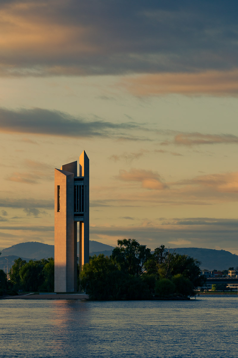
Here is an example. Here I have an image of the Carillon in Canberra against a cloudless blue sky (layer 0). I have added a layer with a cloudy sky (layer 1). I opened the layer style dialog for Layer 1 (double click on the layer thumbnail). I have set the Blend-If to act on Blue colours, and on the underlying layer (the carillon) I have dragged the lower control triangle on the “underlying Layer” control to limit the range of blues where the blending occurs. OK, there is a wedge of blue sky showing through at the top. This can be easily fixed by duplicating a section of Layer 1 (clouds) that covers this blue – just one quick selection; we let Blend If do all the fiddly bits of selection around the trees and the structure.
Blend if can also be used when making more creative composite images and in applying textures selectively… have a play with the controls and see what they can do for you
Rather than more-inventing of the wheel, here are some resources on the web that give instructions on how to use Blend If:
Photoshop’s Select and Mask tool replaces the Refine Edge dialog of previous versions with new, added features, and better “refinement” but at the cost of increased complexity. Rather than re-invent the wheel, I will direct you to some resources which should get you up to speed with this tool.
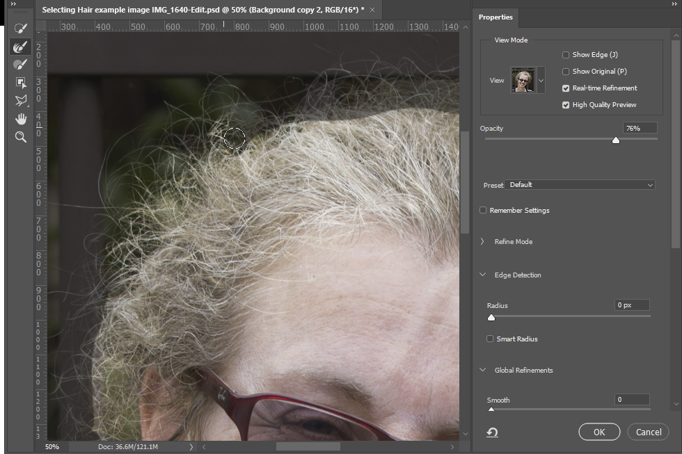
Using Select and Mask to refine the edge of a very crude selection.
Note that I recommend using the selection to make a layer mask to hide the background pixels (non-destructive editing), rather than inverting the selection and deleting the background pixels. With a mask, you can always go back later and tweak the mask. If you delete the pixels, there is no going back.
Adobe Resources
Adobe’s training site has a page that outlines all of the tools in the workspace and includes a video by Adobe educator Julianne Kost that works through an example using the refine edge tool. https://helpx.adobe.com/photoshop/using/select-mask.html.
Another from Adobe gives a technique that uses a brush made from hair on another image to paint in hair strands on your current image, where the background is too challenging for the select and mask tool to get good separation between hair and background. https://helpx.adobe.com/photoshop/how-to/select-mask-hair.html
When compositing it is not enough to simply paste an object onto a background. If you do, it will look artificial and pasted. Shadows are what link the pasted object to the background. Creating realistic shadows requires some technical skills, but also a keen eye for what shadows look like.
Here is an example. The image below of a whiteboard marker illuminated with a large light source. The original photo shows soft shadows, darker close to the marker, and darker in the core. Now, clone out the shadow and we have the image on the right, that looks like the marker is floating and not in any way connected to the background.
Original photo
Shadow cloned out
Here are some things to think about when you are making shadows to anchor your cut-and-paste objects:
What sort of light do you have. Point sources (eg sunshine/moonshine/single light globe etc) give sharp shadows; broad sources (eg light coming in through a window from the sky on the shady side of the house; something in a shaded area; an overcast day etc) give soft, diffuse shadows.
What colour is the shadow? diffuse light from a blue sky tends to be bluish; Light bouncing from a coloured surface will be coloured by the surface; light under tree shade tends to be greenish; flash light from a soft-box tends to be whiter.
Shadows are seldom pure black. Usually there is some light in the shadowed area. Look at the shadow example above. The shadowed area is far from black. Some light from the softbox goes around the marker to illuminate the background. Some light also bounces off other objects and adds light to the shadowed area. The texture of the background is visible. If you just paint black to make a shadow, it won’t look realistic unless you have some transparency to let the texture show. If some of the light bounces off coloured objects to fill in the shadow area, the bounced light will take a colour cast from the surfaces it bounces off. If you have two light sources with different colour balance, the shadows will take different colour balances depending on which light is filling in the shadow.
Is there more than one source of light? For example, someone standing in a street at night might have hard shadows from the street lamp, and soft shadows from the light from a cafe window. Depending on the brightness, the shadows will be different densities and colour balance (eg orangish light from the cafe window will paint an orange glow on the pavement; where there is shadow, the orange light is absent, so the shadow will look slightly bluish.
How far or near are the lights – this affects the brightness as well and the hardness of the shadow edges.
What direction are the light sources. The shadows need to extend in a direction that is consistent with the direction(s) light source(s). Take care where different subjects are added in different positions relative to the light source. For example consider a night scene with people on a street with a single street light. For people between the camera and the light, the shadow will fall towards the camera. For a person underneath the street light, the shadow will be spread around their feet. For a person further away than the light, the shadow will fall to the rear of the image.
The size of a shadow changes depending on the orientation of the light, the subject and the surface the shadow falls on. Your shadow near midday is a small puddle of dark around your feet. Approaching sunset, with the sun just over the horizon, your shadow on flat ground will be very long.
Think about the surface onto which the shadow is cast. The shadow of a person falling on the ground will be a different shape to the shadow of that person that falls on a wall. A shadow falling on a textured surface needs to retain the texture.
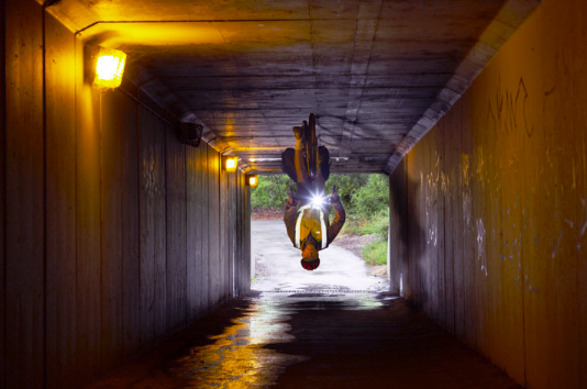
Consider the image below. Note the complicated lighting – 3 different side lights in the tunnel (and another behind the camera), plus light from the tunnel end; but the dominant light is the one at the top left of the frame. Lining up the objects, the shadow from the head needs to be hitting the lowest point on the right side wall; the cyclist’s body is shadowed to fill the whole side wall; the cycle wheels are shadowed on the roof. The lights further along the tunnel cast a shadow forward but much fainter, as they are further away. OK, this isn’t perfect (it was a quick play for amusement), but thinking about the imperfections will help you think about what I should have done with the shadows.
Rather than try to explain the mechanics driving photoshop (or your favourite software), I refer you in the Resources section to some useful guides online.
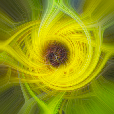
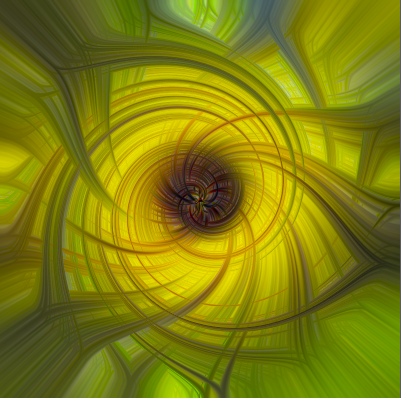
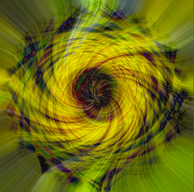
Twirl, found under Filters>>Distort in the Photoshop menu can be used to make some interesting effects. Consider the simple crossed lines image below. Activate the Twirl dialog, and adjust the Angle slider to achieve your desired degree of twirl.
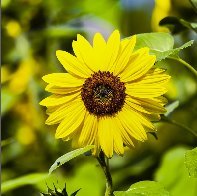
I’ll step through how I made one of the twirled image at the top of this post. First I started with a simple, unexciting, daisy photo (all sorts of things make a good starting point – try some different images with colour and luminosity variations that might make interesting twirls – experiment, because the end result will bear little resemblance to the original). I usually start with a square cropped image, but rectangles will work too. Convert the image to a smart object This allows you to tweak the filters you create to adjust the final output without having to start from scratch each time. More importantly, you can resize the image without losing pixels. If you start with a large image (say 4000×4000 pixels, you have to process 16 million pixels through each filter for each change which can be time consuming. If you reduce this (after converting to a smart object) to say 800×800, you only have 640 thousand pixels to process (Photoshop works on an internal copy with reduced size). Later you can resize back to the original, and Photoshop will recalculate with all the original pixels (it may take a while to rebuild to a large size).
To make the image a bit blocky/pixelated, I used a Mezzotint filter. There’s a selection of similar filters in Filter>>Pixelate.
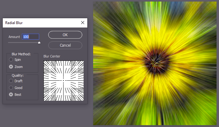
Next, use a radial filter to spread out the pixels from the centre.
If you want even more radial smearing, apply the filter more than once. I used 3 radial filter steps to get a smoother radial smear.
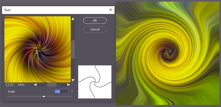
I then applied a twirl filter, then applied it a second time to get a nice spiral. Note that applying the twirl once with a higher angle of twist probably gets you a similar effect – experiment and see.
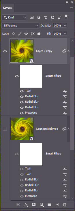
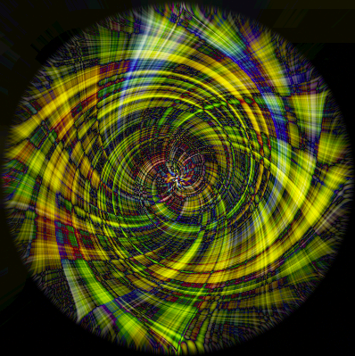
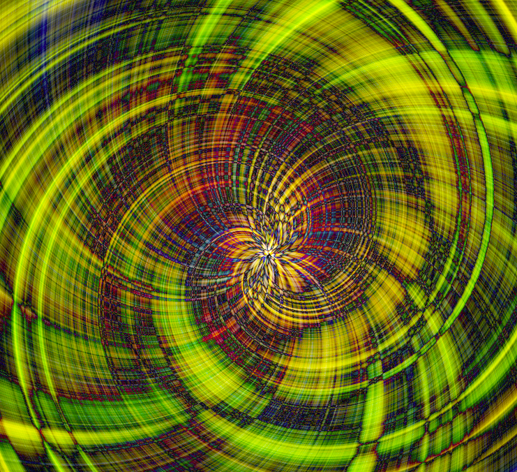
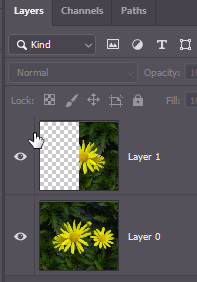
So far, so good, but not too exciting yet. Here comes the magic. Duplicate the smart layer with its filters (right click on the layer label and select duplicate). The smart object is duplicated and you should see the twirl, radial blur and mezzotint filters in the layers panel. Edit the twirls (double click on the filter label in the layers panel – see my layers panel to the right of this paragraph) and slide the angle slider to reverse the direction of spiral. You may choose the same angles in reverse, or try different spirals – time to experiment. The final step is to change the blending mode – this is where the real magic happens. Here are some variants. Once you have chosen the desired look, it is time to resize the image back to the original size… go get a cup of coffee. After your coffee and cake session, if you are lucky, Photoshop may have finished rendering the image (if not, have another coffee, go weed the garden, go shopping for milk and bread, go for a walk or a cycle, take the dog to the park…. eventually Photoshop will finish).
The captions indicate which blending mode was used in the upper twirl layer.
lighten
darker colour
difference (with an added brightness adjustment on top)
difference – this is a crop of central part after I resized back to 4000×4000 pixels (note: with increased brightness adjustment)
difference, with a third twirl layer with different twirl angle added on top. Probably needs some tweaking with brightness and contrast, but you can experiment.
If you want to make bilaterally symmetrical twirl images, a useful trick is to start off with a bilaterally symmetrical image. Usually your images are not symmetrical, but you can make a symmetrical image by selecting the left half of the image using the rectangular marquee (use Image>Image size to determine the width in pixels, halve that. As you drag the rectangular marquee it shows the size of the selected rectangle on an overlay, so you can easily make an exact half-width selection). Duplicate the selection into a new layer (Ctrl-J). Flip the new layer horizontally (Edit>transform>flip horizontal) and move to the right side of the image. You now have symmetrical image where the left half is mirrored on the right half.
Below is an asymmetric image and a resulting twirl. Below that I have made a symmetrical image from the same image, and then the twirl that results (same settings).
I hope this is of use as a basis to get you started. The trick is to experiment with your own images and tweak the settings on the filters (or even try different filters) to see what you can create. If you have any comments, please let me know.
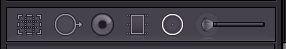
Lightroom has three local adjustment tools (excluding the red-eye reduction tool), the linear gradient tool, the radial gradient tool and the paintbrush tool.
The right three icons are the gradient, radial and brush local adjustment tools
Gradient tool and Radial gradient tool
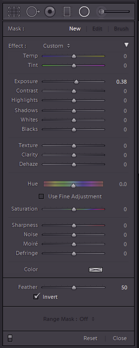
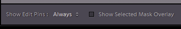
Clicking the gradient or radial adjustment icon brings up the adjustment dialog. You can have many individual local adjustments on your image, each with its own selection of settings and position. The top row of the dialog has which adjustment mask you want to edit – A new one, Edit and existing one (look for an edit pin (small circle overlaid on the image, assuming the Show Edit Pins control (see below image) is set appropriately. To edit the settings defined for an existing adjustment, click its pin. The current settings will be loaded under the Effect list. Click and drag on the image to apply the local adjustment mask. If you want to see the adjustment mask, click the Show Selected Mask Overlay checkbox below the image (the area where the currently selected local adjustment will be applied is overlaid in red, similar to a quick mask mode in Photoshop.
The local adjustment dialogues remember the previously used settings when you create a new adjustment. You might want to double click the word Effect below the mask section, to reset all the adjustments to no effect, so you can set the desired settings for the new adjustment starting from scratch, before you create the next local adjustment.
If you want to change the settings on any previous adjustment, select its pin, and change the settings as desired (including position, size and feathering). For radial masks you can also use the Invert check box to switch the mask from on in the centre to on everywhere outside the centre. So to make a vignette, you might turn off Invert, choose an adjustment that is a drop in exposure, then draw from the centre of the image outwards to generate the vignetting you desire. Alternatively, say to brighten someone’s face, you might set exposure up 0.5 stops, click on the Invert control and draw a radial gradient with a large feather over the face.
Sometimes you may want to tweak the mask for such an adjustment. for example you might use a linear gradient from the horizon up to darken the sky. However, you don’t want to darken the promontory that juts out into the sea crossing the horizon. There are a couple of ways to exclude this promontory from the local adjustment. First, you could paint out that area from the mask – whilst editing the adjustment, click the Brush word in the top line (Mask:) of the dialog. Make sure you have clicked Show Selected Mask Overlay, so you can see the extent of the gradient mask. Move the cursor over the image and it shows two concentric circles representing the size and feather of the brush. Hold down ALT and the central plus symbol changes to a minus symbol. Now, whilst holding down Alt, paint over the bits you want to exclude from the adjustment (ie the promontory). Use the scroll wheel to adjust brush size, and shift-scroll wheel to adjust the feather, and zoom in at 1:1 or greater to allow greater precision in your selection. You can also add to the mask by releasing Alt, so your linear gradient can be extended if needed. Radial gradients can be modified in a similar way.
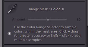
The second way, is to use a Range Mask (see the control at the bottom of the local adjustment panel). In the example we are discussing, you could use a luminance range mask since the sky is brighter than the land. Or a colour range mask since the sky is blue and the land is green. Select a colour range mask, then click the colour sampler tool on the sky. Since the pesky promontory is a different colour it will be excluded from the adjustment by the Range Mask.
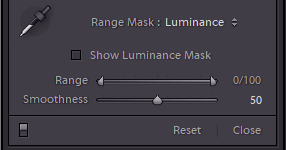
The luminance Range Mask is also very powerful. Here you set the limits on luminance on the underlying image where the mask is to apply. Drag the left slider to the right to exclude darker parts of the image from the mask, or drag the right slider to the left to exclude brighter areas. The Smoothness control adjusts the blending at the edges. Have a play and see what it does on your images.
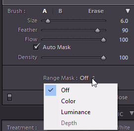
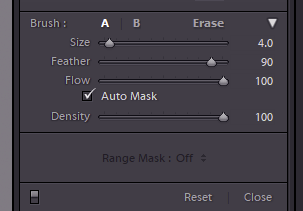
Brush Adjustment Tool
This has similar adjustment settings available as the linear and radial gradients, but in this case you use a paintbrush tool to paint in the mask. Below the settings is a section defining the brush – here you can set the size, and the feather (or use scroll-wheel/Shift-scroll) and the flow (how rapidly the brush strokes build up – with a low flow, you can use multiple strokes to gradually build up the adjustment mask, for subtle effects). You can define two brushes: A and B with different sizes and feather and flow (and the Erase brush also has its own size/feather/flow setting). For example you might have one large for the expanses, and one small for fine detail around edges. Once you have started a mask, you can click the Erase to switch to erase mode, for example if you painted past an edge in error. The Auto Mask setting can be useful to help automatically end the mask when you get to a contrasty edge. Often it will leave quite a speckled mask over the areas painted, but you can turn off Auto Mask and paint over these areas away from the edges you want to define the mask to fill in the missing flecks. The Density control allows you to tone down the overall effect of your adjustments (sometimes it is easy to set an extreme set of adjustments, making it easy to see where the adjustment changes the image, then dial back the effect to a more reasonable level later. There is also a Range Mask control that works in the same way as it does with linear and radial gradient local adjustments.
Think about the light on an image. Consider an image with end of day sunshine casting shadows across a landscape/cityscape. The sunlit areas get warm, orangish light, whilst the shadows will be colder, with light from the blue sky. You can exagerate or reduce this effect with split toning, by selectively tweaking the colour balance in the shadows and highlights. This can give your images a cinematic feel (cinematographers regularly use split-toning effects) or selectively bring out colours for added impact.
You can use split toning more creatively. For example you may want to add a sunset sky to a landscape you took at midday. Using split toning, you can add warm sunset tones to the highlights and cool the shadows for a more end-of-day look. Perhaps you want to make a street scene you took in the day look like the night. Dial down the exposure, boost the exposure round the street-lights. Use split toning to cool the shadows and add warmth to the highlights you added for the fake street-lighting.
Whatever you use it for, remember that split toning usually works best to make subtle adjustments.
Here is an image of the Carrillon in Canberra, comparing before and after a rather inexpert and heavy handed split toning treatment.
Split toning is built into most image editing packages and generally works in a similar way. Look up instructions for your particular package.
Here are some web-resources that might get you started.
Doug Porter is a Melbourne based international and nationally awarded photographer of fine art and pictorial images. You can see his galleries of fine art images at https://frescoimages.com .
Doug gave an inspiring presentation at the Honours SIG meeting on 10th June 2020, showing his editing processes. Watch the presentation on YouTube.
Following his presentation, Doug very generously invited members to submit images, one of which he would select and use to demonstrate his editing style. Fantastically, he did this not for one, but for all 7 images that were submitted. The images are presented below in before/after views. I am sure you will agree that the transformations are spectacular. Right-Click>>view image to see the JPEG files at full size. Doug also gave us the PSD files with the layers so you can follow his edits and see how they work by stepping through the layers. Click the links below the images to download the PSD files (beware these are all large files).
Before smart objects were introduced to Photoshop, if you edited a pixel layer, you changed the data in that layer so your edits were a one-way process. Smart objects changed that. A smart object’s base image is edited non-destructively. Any edits are added as a list of instructions embedded with the object, so you can return later and change those instructions to alter the edits. Since you are not altering original pixels, just changing the recipe for the edits, there are no losses in quality. If you scale, warp, distort you can modify these transforms later. However some operations that change the pixels, such as painting, burning or cloning, cannot be done on a smart object. For these you need to create a copy of the smart layer and rasterise it to allow these edits. For Dodging and Burning you can do this on a separate layer by painting in black or white and adjusting the transparency to adjust the intensity of the effect.
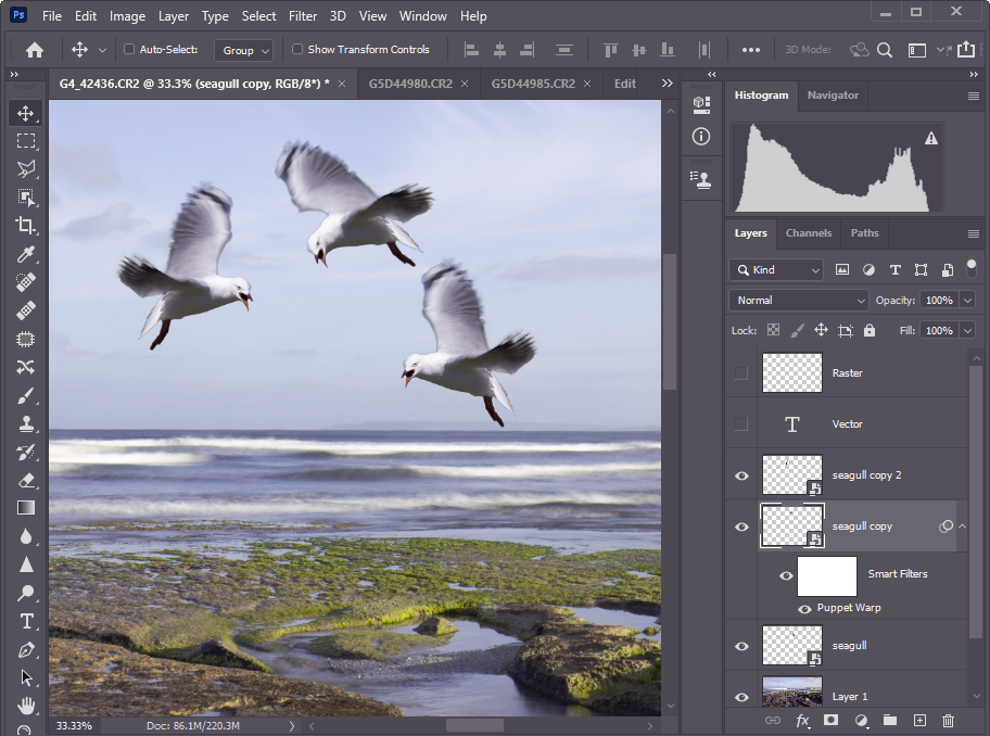
If you are compositing, you can paste in the pixels from another file and right-click the layer name and select Convert to Smart Object. Or you can insert images as linked smart objects rather than pasting in the pixels from the original file. Photoshop will find the needed pixels in the original file when it needs to show them. Your files might be much smaller since you are only adding a link to the original file, not the original file as a pixel layer. Perhaps you are not sure whether bird1 or bird2 is the image to add to your bland sky? paste Bird1 as a smart object. Resize it to suit. Then you can simply tell photoshop to link to Bird2 instead of Bird1 to see what the different image looks like. Bird2 will appear with the same transforms and edits that you set up for Bird1. Want to add several copies of Bird1? Duplicate the layer a couple of times. Move the duplicates to where you want them. Transform them as desired. Photshop only needs to store the edits for the new layers. If you decide you want to make them all a bit whiter? No worries. Adjust the colour and tone of the original layer, and the other 2 layers will change at the same time. In the image below, for example, the 3 seagulls are all the same bird, duplicated as smart layers, moved, flipped and puppet-warped to make them each distinct.
I hope this brief introduction has convinced you that Smart Objects are worth further learning. There is a lot to know about smart objects so I will refer you to more comprehensive resources.
Nik Collection is a popular set of 8 photo processing plugins for Photoshop, Lightroom, DxO Photolab, Affinity Photo and some other packages.
Color Efex Pro — Package of filters that comes with many effects for adjusting tonality and colour.
Viveza — Color control with advanced functions to change contrast and saturation
Dfine — Noise reduction
Sharpener Pro — Image sharpening
HDR Efex Pro — Specialized program for processing HDR pictures
Silver Efex Pro — Black & White conversion
Analog Efex Pro — Applies film-era camera, lens, and film simulation to digital images.
Perspective Efex — Corrects perspective and optical geometric distortions
The collection was developed originally by Nik software which was later bought by Google. Google eventually ceased development and made the program suite free (see below). DxO later acquired the software and resumed development (currently version 3).
Free version 1.2.11 circa 2016
These links may change. The software has undergone some development and improvement since this era, but for the price, this edition is good value if you don’t want to fork out for the current offering.
Currently DxO offer a free 30 day trial, and sells a lifetime license. Among its features, the Lightroom plugin offers a non-destructive workflow (via multi-layer TIFF files). The filters offer a diversity of controls for colour and tonality and a huge range of presets. The denoise and sharpener plugins are reputed to work well.