ON1 Photo RAW is a relative newcomer to the photo editing arena (currently designated ON1 Photo RAW 2021.5), but looks to be feature filled. It includes Digital asset management and a non-destructive, layered editing paradigm, incorporating many features of photoshop as well as Lightroom. It comes with either a one-off license or a subscription model that allows you continued updates as the software develops. They offer a 14 day free trial.
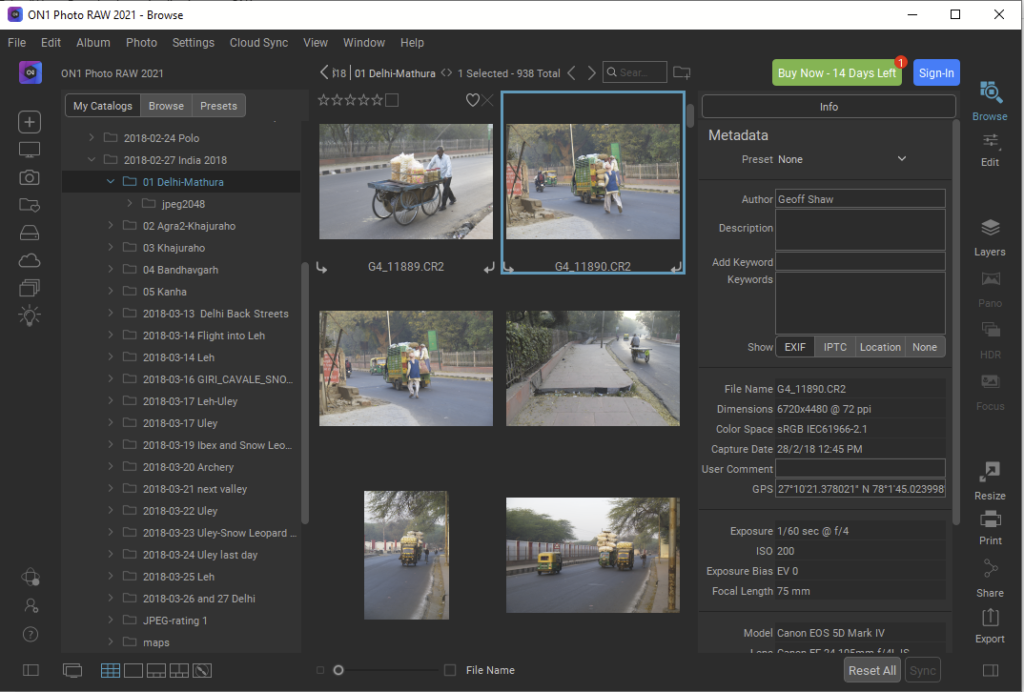
ON1 file catalog screen
According to their website, ON1 can import Lightroom settings from existing LR catalogs (at least this is scheduled for the October 2021 release). It has photo-retouching tools, cloning, healing, removing blemishes, noise reduction, content aware fill etc. It handles HDR, focus stacking and panoramas. It uses some AI approaches to aspects of its image processing. It can also operate as a plugin for Adobe, Affinity and Corel applications.
On1 edit screen
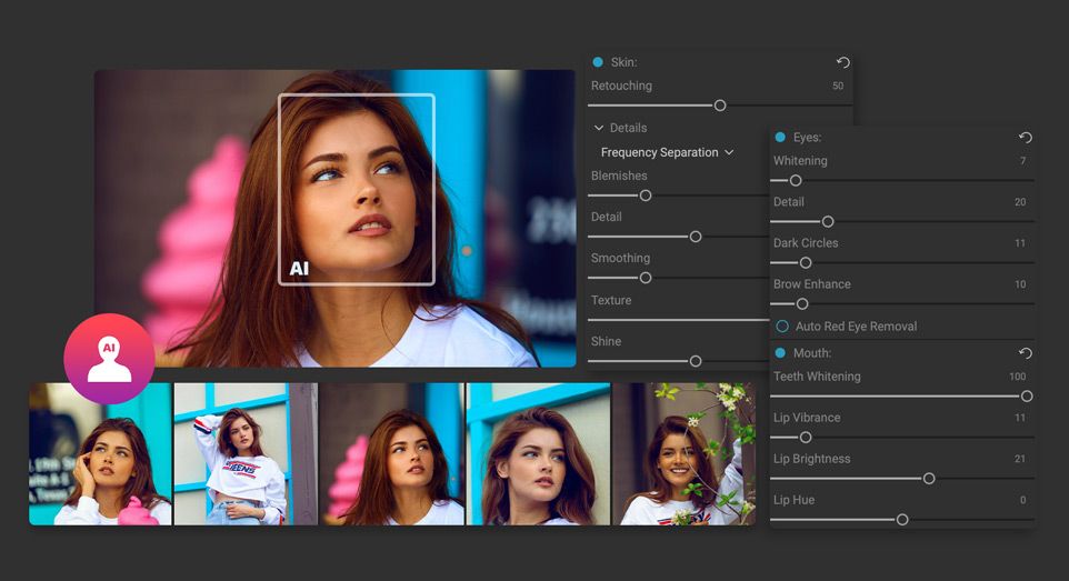
On1 has a few specialised features. Notable is an AI powered portrait editing mode that looks to be quite powerful. It automatically identifies features like lips, eyes, eyebrows etc and provides controls to adjust their appearance. You can also modify the shapes and sizes of the face or face parts. If you do lots of portraiture it is definitely worth a look.
On1’s portrait mode. Image is one from their main website
darktable is an open source photography workflow application and raw developer. A virtual lighttable and darkroom for photographers. It manages your digital negatives in a database, lets you view them through a zoomable lighttable and enables you to develop raw images and enhance them.
Darktable is a powerful program with a wealth of features. Rather than re-inventing the wheel with a detailed analysis, I’ll give a quick overview of some of the main features and leave you to check out the reviews and comments section below.
Darktable has powerful features for image organisation and digital asset management. You can star-rate images, add keyword tags, edit metadata and so on. It is a powerful RAW image processor with a non-destructive workflow. Edits are saved and you can save the edit lists as xmp files with the original image if you wish. It supports a powerful array of processing filters, and can apply effects locally with a variety of mask creation tools. It has a mapping module that allows you to make use of the geolocation data in files. You can even control your tethered camera using Darktable. The couple of screenshots below give you a feel for the workspace. To my mind it looks quite similar to Lightroom’s.
Darktable’s Lighttable workspace where you can organise images, sort, select, rate, tag, edit metadata and so on.Darktable’s Darkroom workspace where you can edit photos
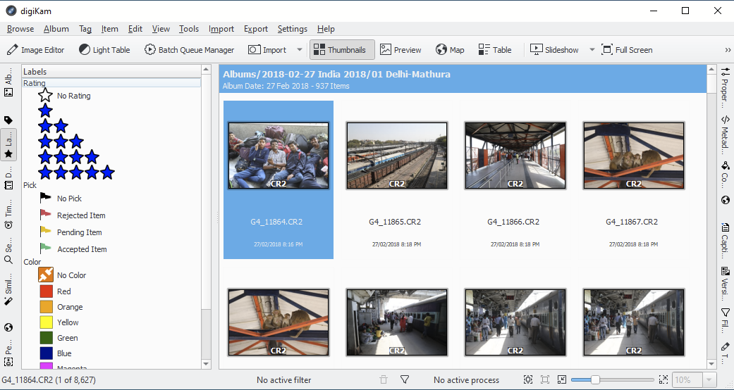
DigiKam is a free, open-source package for Linux, windows and macOS. It has strong digital asset management and a comprehensive processing workflow. It has powerful RAW file editing and a non-destructive workflow (edits are saved in a database). It supports a huge range of file formats. There is extensive documentation at the DigiKam website. Below are some screen shots to give you a feel for the program.
Some links to reviews are at the bottom (not all are for the latest version). My impression is that this free program provides a lot of power. It isn’t a slick or as fast as Lightroom, but it offers a huge array of features, notably in digital asset management (cataloging, metadata editing, organising, searching etc) that is lacking in most image processing software. And it is free, so costs nothing to try it out.
DigiKam’s main screen. Tabs at the left allow you to view the folder structure, ratings, keywords/tags, a timeline, advanced search functions, image similarity (great for winnowing duplicates or near duplicates), maps/geolocation, and people indexing (it can search images for faces and if you give names to faces, it will try to find similar faces in other photos, allowing you to search for specific people, once you have identified that person in photos).
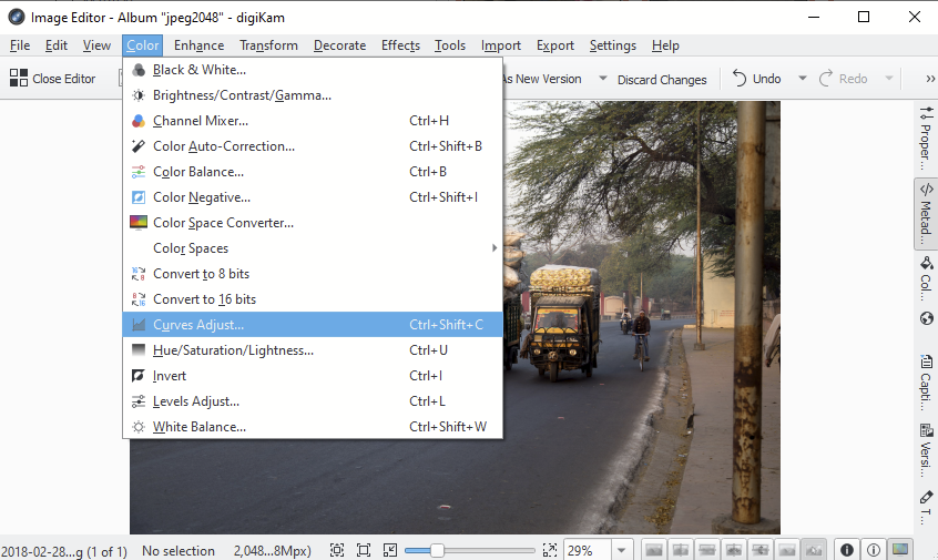
The image editor window gives access to a wide range of editing tools. The tabs at the right give access to image properties, metadata, a map, captions and tools (see below).
The tools tab gives access to a lot of functionality including links to the image editor, tag manager, batch manager, a light table (good for sorting images, comparing images side by side, rating, tagging etc). Post processing tools include image stacking (HDR, focus stack), generation of calendars, web galleries etc. Export tools allow you to export to local storage or a range of online systems. You can also import images from your SmugMug or Google galleries, or from a scanner.
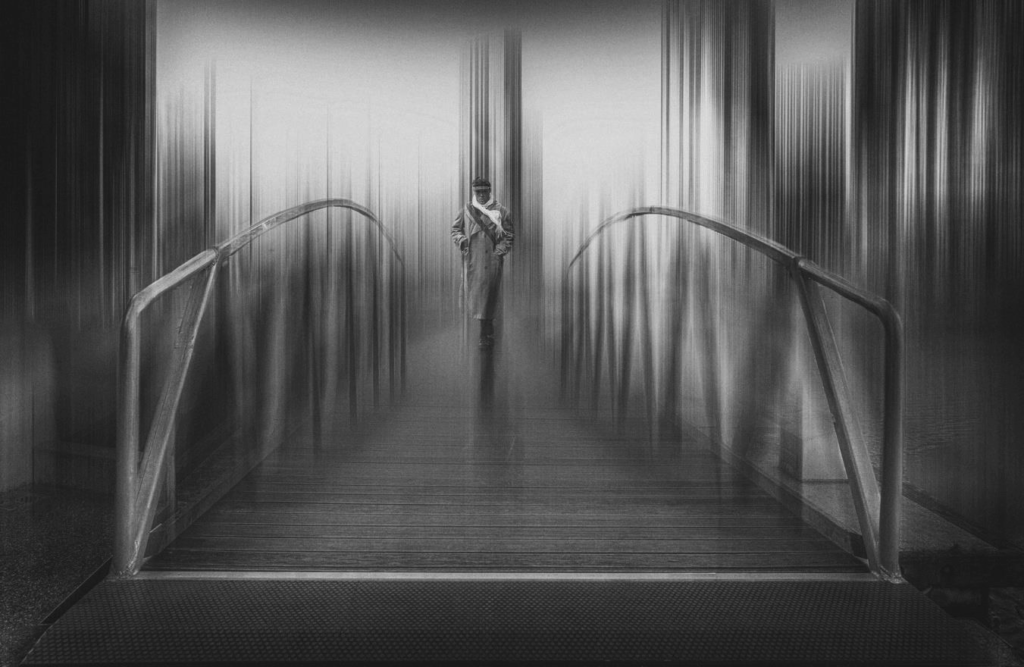
So you spent years learning how to shoot images in focus? Just for a change here is how to make an intentional blurred image such as the one below
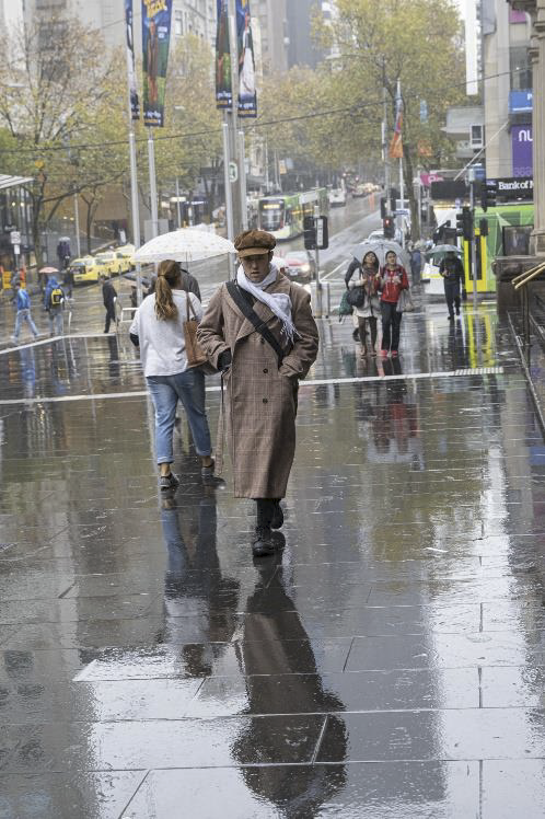
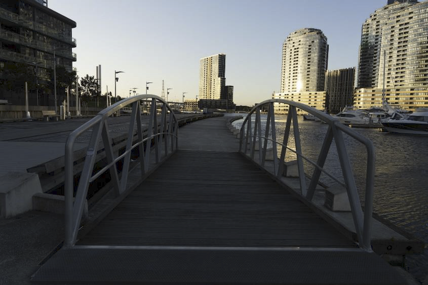
Source images- demonstrating you can make something out of not much!
An outline of the steps taken:
First select an image (or images) that you think will work. A wide angle image with a point of interest you can reintroduce in a masking step is a good start
Perform basic black/white point adjustments and ensure the buildings are straight (lens correction)
This technique uses photoshop- the first step selected the man from a wet day in Melbourne and pasted and positioned him in the walkway image taken at a club outing to South Wharf. Remember to include reflections or shadows if you have them in the original image. In the case of the man it was a reflection
Duplicate the layer that now contains the man and background and convert it to a smart object (right click on the layer- convert to smart object). This ensures you can still see the settings you use and can make alterations
To create the blur I used filter/blur/motion blur. The setting was 1267 pixels at 90O
I then added a mask to the layer and masked out the effect in the foreground as I wanted the image to be grounded
I then duplicated the layer in step 4 again (before blur), added it to the top of the layer stack and added a black mask to bring back the blurred layer. I then painted in white on the mask to bring back areas that I didn’t want to see blurred eg the man and the railing leading into the image
Final step was to convert to B&W using Nik software and darken areas on the edges
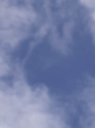
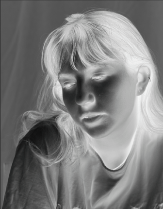
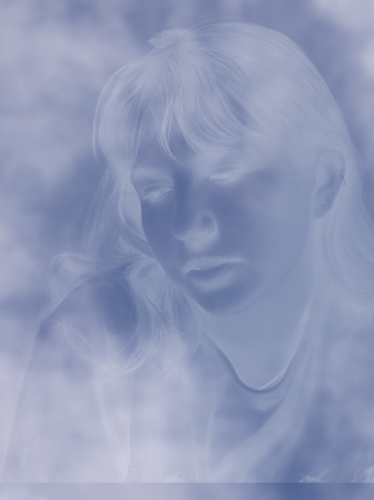
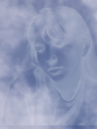
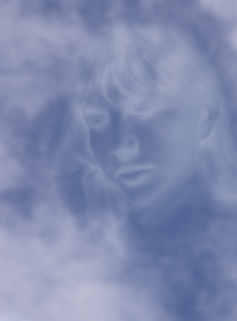
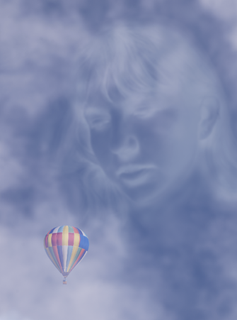
This How-To covers Stephen Hilton’s approach to create his image Face in the clouds.
Start with a sky as your background layer (below). If the clouds are little dull, brighten them up with a curves or levels adjustment. Tip: I found it best to have a patch of sky with minimal cloud for overlaying the face as it made the face stand out better.
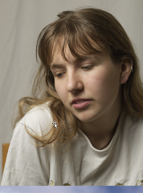
Paste a face into a new layer. Tip: you can lower the opacity of the face layer to help you position the face in the desired position.
Apply an “Invert” adjustment to the face layer, followed by a “Black and White” adjustment.
Set blend mode to “Screen” and lower the opacity to taste (in my case, about 40% opacity).
Apply a Gaussian blur adjustment (in my case, about 7 pixels).
Add a mask to the face layer.
Select brush tool.
Set to black brush, low flow, low hardness (I used 5% flow and 0% hardness)
Gradually paint out unwanted areas by painting onto the mask with the black brush. Tip: if you make a mistake, change brush colour to white and paint onto the mask.
Select brush tool.
Set to black brush, low flow, low hardness (I used 5% flow and 0% hardness)
Gradually paint out unwanted areas by painting onto the mask with the black brush. Tip: if you make a mistake, change brush colour to white and paint onto the mask.
You may need to tweak the white balance of the cloud layer to match the face. Mine was pretty close and the adjustment was barely noticeable.
You can use a soft, white brush on the background layer to fill in the cloud if there are any gaps. I did some very subtle adjustments here.
Add the balloon on a separate layer to get the final image
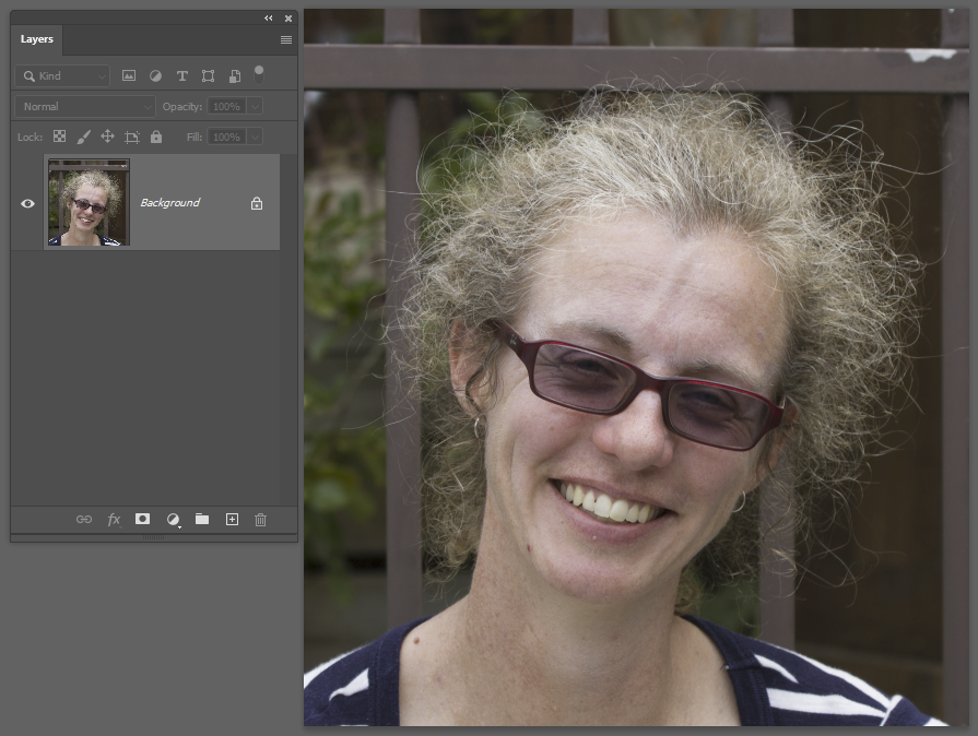
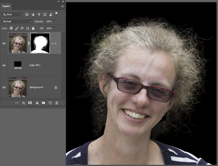
Adobe’s select subject tool (and some other applications have similar functionality) is becoming remarkably good, using AI approaches to make sometimes fiddly selections automatically. Here is an example.
This is a particularly challenging image – the background is mottled, not a uniform colour and brightness. There are heaps of flyaway hair strands. Trying to select the person from the background using the traditional approaches isn’t simple.
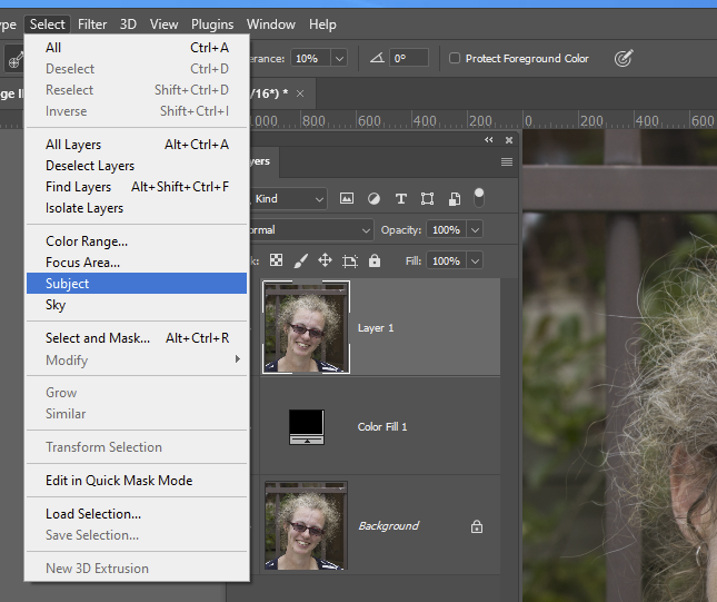
Let’s try the AI powered Select Subject tool. First I have duplicated the background layer, and added a black colour fill layer underneath it — you will see why in a second. Now apply the filter.
And the result is this
The Marching Ants view doesn’t clearly show the detail of the selection, so let’s click the Make Mask icon (the white rectangle with black circle in it) from the tools at the bottom of the layers panel. Now the underlying black colour layer shows through the masked areas so you can see how beautifully the selection has dealt with all of Danielle’s frizzy hair.
OK, it’s not perfect, but you can always refine the selection/mask using select and mask or other selection tools.
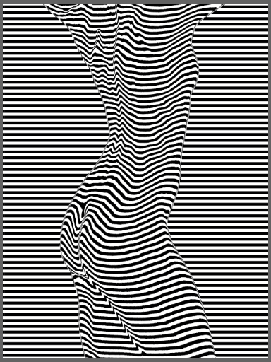
The displacement map filter is found in Photoshop under the menu items: Filter >> Distort >> Displace. A displacement map moves the pixels of an image by an amount that varies depending on the brightness of another image. I will give two examples below.
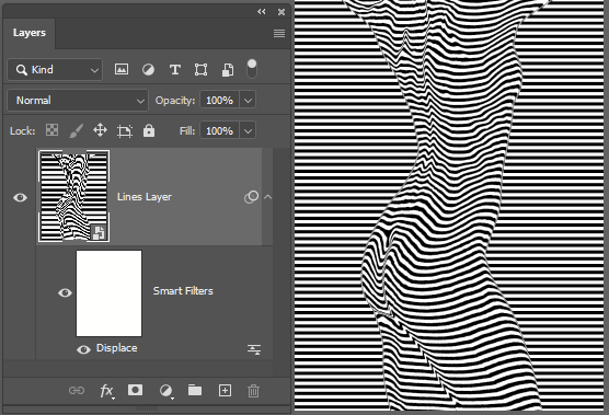
Example 1: Curvaceous 2.
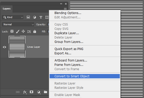
For example 1, I generated a grayscale image comprising a set of horizontal lines. I converted this image layer to a smart layer (right click on the layer name and select Convert to Smart Object) so I can tweak the filter later with the least amount of effort.
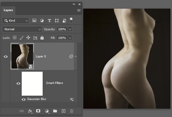
Now organise your source image. I opened this in Photoshop from LR, made it into a smart layer, and saved it as a PSD (Photoshop wants PSD files for the displacement map) in the folder with my horizontal line image (so it is easy to find). Based on past experience, I applied a Gaussian blur filter – without a bit of blurring, the end result can be a bit frizzy. You can play with the filter and adjust the degree of blurring to experiment with the effect on the resulting displacement map image.
Save the modified PSD file and switch back to the horizontal line image.
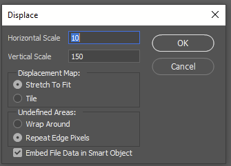
Next, apply a displacement filter (Filter>>Distort>>Displace). Choose the settings. Horizontal scale indicates how many pixels distance the maximum displacement will be in the horizontal direction. Vertical scale … you guessed it. I chose “stretch to fit” in this example, but it wasn’t necessary since the two images used were the same size at the start. The screen grab to the right shows Repeat Edge Pixels but after seeing the effect, I decided the Wrap Around setting was the one to use for this image.
Apply the filter and see what effect you get. If it isn’t what you want try one of the following: * change the settings of the displacement filter. Increase or decrease the displacement scales etc. Since this is a smart object layer, you can double click the Displace filter for the layer and the filter will open and after applying the new settings, the smart layer will update to the new settings. * have a play with the image used for the displacement map. Tweak the contrast levels, apply local adjustments, apply artistic filters etc… to adjust the source (if you are using smart layers the edits and filters will be non-destructive so you can try out lots of settings quicly. Unfortunately you will need to re-apply the displacement filter in the other image to see what effect the tweaks to the displacement map have had.
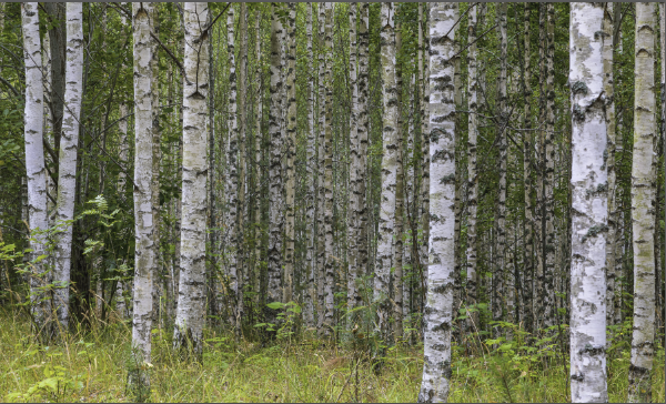
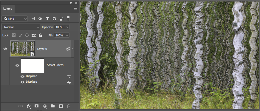
Example 2: A woodland scene
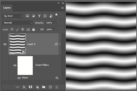
Here I have a bit of Scandinavian woodland. Just for fun, I am applying a wavy displacement map image. For this I made repeated gradients to make horizontal stripes, then added a wave filter to give it a bit of wobble in the vertical direction. Since this image is already blurred, there was no need to apply a Gaussian blur filter to smooth out any jagged bits.
Switching back to the woodland I apply a displacement filter – actually I added two, one 5pixel horizontal displacement with the horizontal lines, then added another displacement with the wavy version (you can see two Displace filters under the Smart Filters:
OK, so this isn’t going to win a prize, but hopefully it serves to illustrate the approach.
Here are some other ideas. Use a displacement map to apply a canvas texture or other texture to your image (use an image of canvas, tree bark, something else as the displacement map image); make a reflection on water by applying a displacement map to generate distortion to match the waves in the water; make colour or pattern overlays wrap round a shape using a distortion map.
Krita is a free and open source graphics editor for Windows, Mac OS and Linux. It is designed primarily for graphic artists for digital painting and 2D animation, but it is also a competent editor for photos. Its user interface has the usual features with multiple configurable tool panels and straightforward menus. Workspaces can be customised to suit your workflow.
Krita supports layers and masks, blending modes, a wealth of non-destructive filters (with real-time preview), different colour models (RGB, CYMK, Lab etc, and so on. It supports at least some RAW file formats, but lacks a sophisticated RAW processing back end (ie no equivalent of Adobe Camera Raw). If you want, however, you can process your RAW files in powerful free programs like DarkTable or RawTherapee (or Adobe Camera Raw – also a free download at present), then export to TIFF or PSD to import into Krita for further processing.
From time to time you may find you just don’t have enough pixels in your image. For example you may want to make a huge print from your image (or a smaller print from a cropped part of your image). Just enlarging the image will produce a blocky or pixellated image. Fortunately there are better approaches. The example below relates to Photoshop and Lightroom, but if you are using other software, it is likely you will have access to similar alternatives.
Upscaling/Resampling options
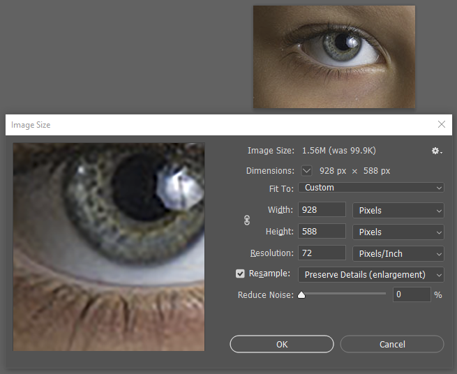
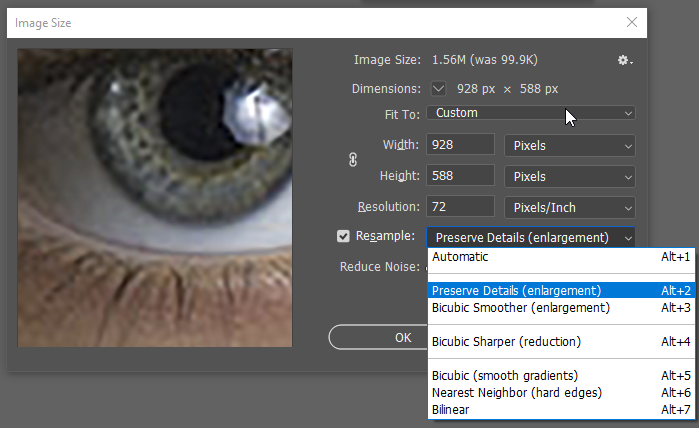
In Photoshop, you up-scale images using the menu Image>>Image Size. In the screen grab below I am changing an image 232 x 147 pixels at 18 pixels per inch up to 72 pixels per inch (928x 588 pixels) – ie a 4-times enlargement in each dimension. Note that the resample box is checked. You can choose to adjust the size by entering new width or height (note the chain link to the left of the width/height boxes – if you click this the height and width will be bracketed by a thin line and this setting keeps the width and height locked so they change in proportion), or you can change the resolution (in my case I changed it from 18 to 72, a 4-times increase). This changes the horizontal and vertical resolution so the aspect ratio remains unchanged.
Note that a 4-times increase in linear dimensions is dramatic! I only chose this to highlight the differences in the results for up-scaling.
With resampling ticked, you get some options for the algorithm used to up-scale the image. The automatic setting will attempt to choose the best option, but you can also manually select the setting to suit your needs/the characteristics of the image you are processing.
Here are some examples. Note you may need to click the images to get the full size image for best comparison – the HTML page might resize the images to fit your screen so you will be looking at a resized resized image.
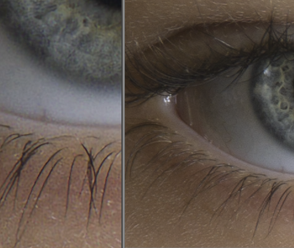
Original image downsized to one quarter to make a starting point for up-scaling tests..Note that a 4x up-scaling is fairly dramatic. every 4×4 pixel block has been averaged to a single pixel. ie you convert 16 pixels to one pixel – you throw away 93.75% of the original pixels. Now, how good can the up-scaling be to restore the quality lost?
Upscaled 4x, using nearest neighbour. The simplest method. Each pixel becomes a 4×4 block of the same colour. Note the pixelated appearance, particularly visible around edges.
The image below used bicubic (smooth gradients) interpolation, which takes generates the new pixels using an algorithm using a weighted average of the surrounding pixels. A much better result than the nearest neighbour interpolation.
bicubic
Below I used the bicubic Smoother (enlargement) setting. very similar to the Bicubic (smooth gradients) but perhaps a little more detail/contrast on the eye lashes.
Below I used the preserve details (enlargement) setting. This brings out more fine texture in the skin and a bit more contrast on the lashes.
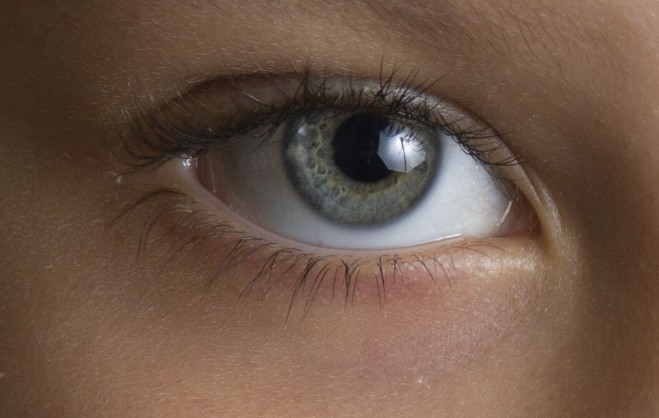
Here is an original image. Note the sharpness of the eye and the smooth texture in the skin. It shows you cannot throw away 94% of the pixel data and expect to magically restore it without loss of quality.
This is the original image before downsizing/up-scaling to show the ultimate quality of the original
There is one more option to consider. In Adobe Camera Raw based programs (eg Lightroom and Photoshop) you can also get an additional up-scaling algorithm “Enhance” which uses Artificial Intelligence algorithms to enlarge a RAW image by a factor of 2. You can actually use this algorithm on non-RAW images by opening them in the Adobe Camera Raw (ACR) application, but I suspect the results will be worse without the extra information buried in the RAW file. See https://helpx.adobe.com/camera-raw/using/enhance.html for more details. In the image below is a screen clip of part of a compare images panel in LR. The left side is the enhanced version (2x) of the image on the right. It looks to do a fairly good job. Note this is not a good comparison with the resizing examples above, as this is enlarging the original image and only using a 2x enlargement.
UPDATE (2022):
Topaz Labs make an AI based program, Gigapixel AI, that can do an excellent job resizing images. It works as a plugin to Photoshop too. But take care to check the output – sometimes it introduces some glaring artefacts.
A commonly asked question is what subjects are best for monochrome? I have been casting my mind over this and I cannot give an answer. Thinking back over the last year, I have made monochrome landscapes, cityscapes, seascapes, portraits, photojournalism, nature … I don’t think I have made any monochrome abstracts lately, but then I haven’t made many abstracts of any sort recently , but swirling patterns of smoke might be good in monochrome, for example. So, I’m not sure it’s a question of what subjects should be in monochrome, as when would I make a captured image into a monochrome. Colour is powerful. We see the world in colour, and colour dominates many of the images we see. However colour can also distract our attention. A simple monochrome conversion is just a button click away, so it is easy to get a quick preview… for example in Lightroom I can create a virtual copy, convert to B&W (LR has a standard B&W, but also a suite of monochrome presets you can apply at the click of a button). Here are a couple of versions of a photo I took in Spain. In this case I thought the blue of the sky drew the eye away from the rest, so I thought the mono was a good option. I had a play on the mono version – selectively darkened the sky and strengthened the contrast (easy to do in mono), and lightened some of the detail in the canopy. I think the mono worked out quite well.
OK, that’s an architectural example. How about something different.
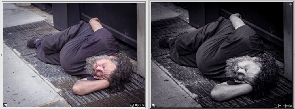
Here I think the skin colour warms the image; the mono version is harder, more gritty, better suited to conveying the hard life of the homeless man in New York.
Here is another reason to convert to mono:
In the colour version the bright colours in the background distract the attention from the story – the chainsaw racing competition. The blue marquee roof and bag in the background, the orange helmet, the red cowling on the saw and the red flash on the pants don’t add to the story. By converting to monochrome (and cloning out the other competitor on the right margin, I remove the distractions so you can focus on the story. You see better the spray of sawdust and the falling disk of wood.
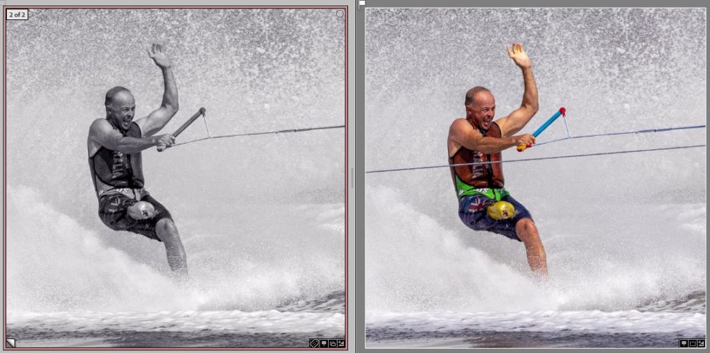
Here is another, on a photojournalism theme – Sam Bell waterskiing at the Moomba festival in Melbourne in 2019.
Again, I don’t feel the colours in the colour version add to the story. By converting to monochrome (and cloning out the other tow rope) I think the story conveyed is at least as powerful, though in this case I think it works in colour too.
OK, just for variety, here is another
In this case, the brightly coloured costumes are central to the story. Whilst the monochrome version depicts the scene, I don’t think it coveys the narrative as powerfully. Maybe I should try a version where I select everything except the dancers, and desaturate the colours in the background. This might help to focus the eye more on the dancers, removing the crowd as a background distraction.
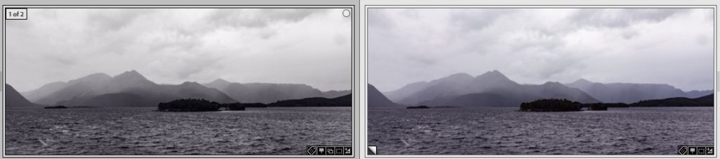
Here is a landscape
It’s a scene with virtually no useful colour – the tones and lines are the story. Monochrome is a perfect choice.
Whilst I have given a few examples here, I am not sure if there is an easy answer to what images make the best monochrome. But here are some rules of thumb to consider:
Does colour add to the story?
Are there colourful distractions that need diminishing?
Is the story of the image in the lines and tones?
Could a monochrome conversion add drama to an image?
These examples have all used conversion to Black and White. You can also make monochrome with different tones – sepia (warm tones) and cyanotype (cold tones) are two examples. These tinted conversions can convey a mood or tone, perhaps, better than plain B&W. Again, experiment and see what you like. Also look at other people’s images – what monochrome conversions have they used? what toning? Learn from examples.
As with many such questions, there is no one answer. The best bet is to experiment with your own images and see what you like in Mono vs colour.