Contents
hide
Geoff Shaw’s suggestions
For some general comments on triptychs see HERE. This post will give a couple of approaches using Lightroom and using Photoshop. I use an example with the three images below (screen grab from my LR catalog).

Lightroom.
- In Library view select the 3 images you want to make into a triptych. I suggest you put the 3 images into a collection. In grid view, drag the image thumbnails into the order you want in your triptych.
- Select all 3 images.
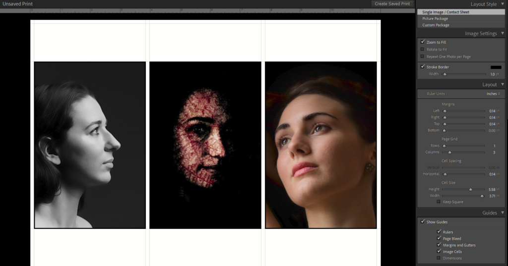
- Switch to Print view. In the default mode it assumes you are printing to A4 paper. Let’s stick with that for now. The screen should look like this.


- Adjust the settings in the Layout Style panel on the right of the screen.
- For now, select Single image/Contact sheet.
- Check down the page to the Page Grid setting and set for 1 row and 3 columns for your triptych.
- In the Guides section, click Show Guides to see guides for the margins and cell spacing.
- In Image Settings, click Zoom to Fill to get the images to fill the space (if the images are too large you will find not all the image shows).
- Choose if you want each panel to have a border and set the colour and thickness (Stroke Border).
- In Layout, set the left, right, top and bottom margins and the cell spacing (space between panels). As you change these values you will see the changes reflected in your layout.
- If you need to reposition any of the images in the 3 panels just click and drag to move the image within the space available for it.
- Once you are happy with the appearance, click the Print to File button at the bottom right. Select a destination file name and click Save.
- Open your output file in Photoshop and use the usual tools to crop off any excess white space, and resize the pixel size to whatever is needed (eg 1920 x 1080 px max for WCC competitions).
If you want to make a triptych with uneven sized panels or more complex layouts, you can do this using the “Custom Package” option in the Layout Style panel.
- In the Cells panel click Clear Layout
- drag the thumbnails from the image filmstrip below onto the print area.
- Drag the images to where you want them. Use the corners to resize to get them to the same height. (note. Click the Lock to Photo Aspect Ratio checkbox to make sure you don’t distort the images).
- Print to file.
- Open the output file and crop and resize as needed.
Photoshop
OK, if you are using Photoshop, you probably have a good idea what to do. Here are some brief suggestions.
- Create a new empty image of the size you want.
- Use the View>>New Guide Layout menu to open a dialog where you can set a layout with 1 row, 3 columns and a suitable spacing (gutter).
- Drag the guides about until you have the guides reflecting the layout you want.
- Drag the 3 images you want to use onto the canvas. They should be added as new smart layers.
- Select each image in turn. Use the transform tool to resize and reposition each image within the frame made by the guide lines.
- make a rectangular marquee in the area you want to be visible. If Snap to Grid is active, the marquee will match the guidelines.
- Mask the layer.
- Repeat the resize/reposition/mask for each of the other images.
- If you want a stroke/shadow etc round each image frame, then you can apply these in the Blending Options for each image layer.
Further reading
There are always lots of different ways to do things… here are some other resources.
- https://learndamophoto.com/blog/2017/12/28/making-triptychs-in-photoshop
- https://petercripps.photography/2019/10/22/creating-a-triptych-in-photoshop/
